grommet | based framework that provides accessibility | Frontend Framework library
kandi X-RAY | grommet Summary
kandi X-RAY | grommet Summary
a react-based framework that provides accessibility, modularity, responsiveness, and theming in a tidy package
 Support
 Quality
 Security
 License
 Reuse
Reuse
Top functions reviewed by kandi - BETA
- A box that provides stacks control
- Normalizes the style color to use .
- a function to use state based on groupState
- Return the transform origin for the align element .
- Returns the opacity of the given value .
grommet Key Features
grommet Examples and Code Snippets
 Lines of Code : 4License : Permissive (Apache-2.0)
 Copy
Copyimport { Grommet } from 'grommet';
import { hpe } from 'grommet-theme-hpe';
  import { Grommet, Button } from 'grommet';

  import Grommet from 'grommet/components/grommet';
  import Button from 'grommet/components/button';
import React, { useState } from "react";
import { render } from "react-dom";

import { grommet } from "grommet/themes";
import { Box, Button, Layer, ThemeContext, Grommet } from "grommet";

export const App = () => {
const [show, setSCommunity Discussions
Trending Discussions on grommet
QUESTION
I want to loop over my function SliderComponent, with different inputs, inside the Html in order to create several components. I found this solution online where we build string and return as Html, using "id" and "getElementById" but I can't make it work.
...ANSWER
Answered 2021-Nov-04 at 15:51You should use the componentDidMount hook instead of onload.
componentDidMount() is invoked immediately after a component is mounted (inserted into the tree). Initialization that requires DOM nodes should go here (like in your case).
Read more about componentDidMount here - https://reactjs.org/docs/react-component.html#componentdidmount
QUESTION
I hope I can ask this question in a way that makes some sense as the data itself is not good. However, as it was written in the 1950s, I have no option but to try to make the best of it in trying to bring it into the current century for those of us who need it. Also, Benchmark speed is not an issue as this is run manually and only rarely, and always on my local PC rather than on the live server. The resulting table is then uploaded.
To outline, it is looking in the Models field in parts_listing to see any with the ordinal numbers 22ND, 23RD etc. If there are any, then it looks in parts_modelno to find all that begin with the cardinal number 22, 23 etc. It takes all that match and populates parts_parsed with the rows in the select statement. It is doing that but it is getting all from parts_modelno, not just those that match.
For the first query below, it works well but needs multiple copies, one for each of the ordinal and cardinal values of 22ND, 23RD, 24TH, 25TH, 26TH, 54TH and 22, 23, 24, 25, 26, 54.
The Models field being queried in parts_listing contains data that varies considerably and another query has already extracted the bulk of it. For example, 2250-51-52-55-70-71 is a shortcut for 2250, 2251, 2252, 2255, 2270, 2271 and there are others such as these below with each example being in its own row. Those have already been parsed into parts_parsed. Those with BODY (and similar ones with MODEL) are not being parsed properly but that's another issue and not important here.
ANSWER
Answered 2021-Sep-13 at 14:34There are 3 slightly different versions of the solution here, for various versions of MySQL and MariaDB.
MariaDB 10.5 is compatible with all 3 solutions. MySQL 8.0 is compatible with 2, and MySQL 5.7 is compatible with just one of the following.
The pairs derived table or WITH clause term provides the pairs of patterns ('25TH', '25'), etc.
Once we have that, it's just a matter of joining with that list in your original SELECT query expression, used to generate the rows to be inserted.
QUESTION
I'm trying to get all possible combinations for each list in a nested list. I've tried the following code below, but it is printing an empty list
...ANSWER
Answered 2021-Jun-24 at 07:45Check the lengths of all the elements in variant. You'll see that one of them has length zero.
QUESTION
The task is to make a website on React, and then the same mobile application. The mobile application will almost completely repeat the web application.
I didn't develop mobile apps before, and now I'm trying to figure it out. As I understand, the easiest way would be to use React Native for a mobile app. Is that so? Or are there more convenient alternatives? (Not WebView)
I would like to have, as far as possible, a single code base, and reuse React components in React Native.
I see some features that need to be considered:
- Styled Components instead of css
- No display:grid
What else do I need to consider immediately before starting development?
How will React Native react to such web-specific things as :hover in styled components? Will it throw out an error or just ignore it?
What UI frameworks can I use? For example, I see that Grommet and Rebass use styled components. Will their components work on React Native?
Or for example, antDesign - it has a version for React Native, the syntax of the components is similar in appearance. Can I reuse components from the web version in React Native by simply importing the rn version of antd?
...ANSWER
Answered 2021-Apr-20 at 18:16Good question. I can answer from the Grommet perspective, sound like Grommet will work fine for your top requirements, it uses styled-components instead of CSS, and it does support mobile device or different window sizing with its built-in t-shirt sizing mechanism of 'small' (mobile), 'medium' (tablet), 'large' (desktop) and other optional user custom styles.
I'm not sure to what scale you'll need a React Native support, but I was able to build many Grommet mobile applications that support mobile devices without using React-Native.
QUESTION
When I try to import a layer/button onto one of these cards it does not allow it to be clicked or interacted with. I believe the problem is with the carousel. What is a way I can fix this? The "CenterLayer" is supposed to act as a button and is the one I am having problems with. When I put this code the layer appears on the card as a footer but it's not allowed to be clicked. Is there anyone that can help me with this, please?
...ANSWER
Answered 2021-Mar-25 at 20:11Carousel is an interactive element, i.e. it has its own focus and navigation behavior, and for UX & accessibility reasons you shouldn't place nested interactive elements inside of each other, hence I'd try to avoid a button inside of a card, inside of a Carousel.
That being said, the button you've placed in the card is placed 'behind' the Carousel, so moving up its z-index would solve the problem. Add this style to a Card and it should do trick
I chose 100 as a random number, feel free to make it smaller according to your app behavior.
QUESTION
How can I make this into a working carousel that shows 3 or more cards at the same Carousel spin? Here is an example code that I've put together and had trouble showing more multiple cards on different spins. My goal is to be able to show multiple cards on every spring (out of total of four spins) of the Carousel.
...ANSWER
Answered 2021-Mar-24 at 15:13I've fixed the example for you, the number of Cards displayed for each Carousel switch is up to the content you'll be placing on the Carousel's child. I've cleaned up some redundancy and separated the Cards into reusable components that will be used as Children. Also, please be mindful to use the theme as mentioned on the Carousel's docs, I don't think we needed the theme for this exercise so I have removed it.
QUESTION
I just took the example of https://v2.grommet.io/datatable and extended it with the pagination attribute, but this has no effect and the table doesn't change.
...ANSWER
Answered 2021-Mar-23 at 04:43The Pagination component and features are only available starting grommet v2.17.0 (which was released less than 30 minutes ago :) ) Go to your package.json, upgrade grommet to use grommet v2.17.0, install dependencies and the example you have shared should work without a problem, good luck.
QUESTION
Just started using Grommet. I must be missing something obvious because I feel like I'm trying to do something fairly simple. I've created a custom theme, and I'm trying to add a hover state to change the background color of a Button. The default hover behavior remains, and the background color does not change.
Here's an abbreviated sample of my code:
...ANSWER
Answered 2021-Feb-14 at 11:22You can use the extend attribute on button, which value is a function to do something like this:
QUESTION
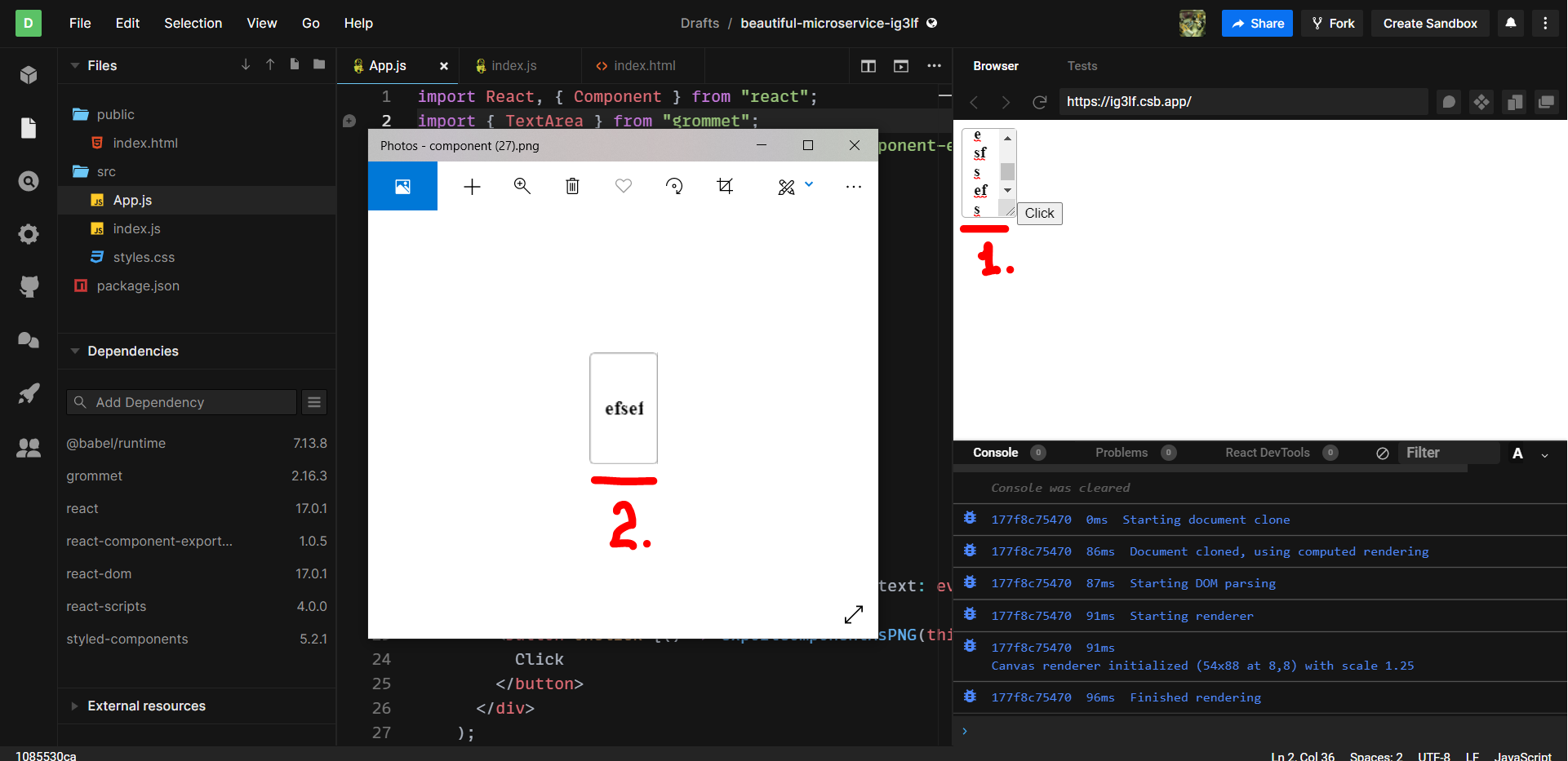
I want to export Grommet TextArea as an image. The following code works if there is just a single line of text. But if I adjust the TextArea component in a way to make the text fill multiple lines, this won't be exported in the output image.
This is how it looks (1 - is the page which contains the multiline TextArea I want to export, 2 - the exported TextArea, containing just a single line of text)
Seems like I'm just missing something about HTML canvas. Or maybe there is some property in Grommet TextArea which helps with changing that behavior?
App.js:
...ANSWER
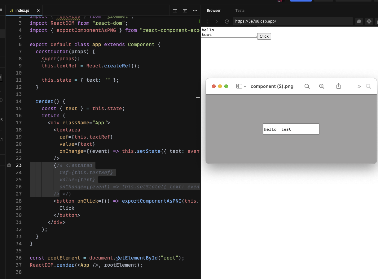
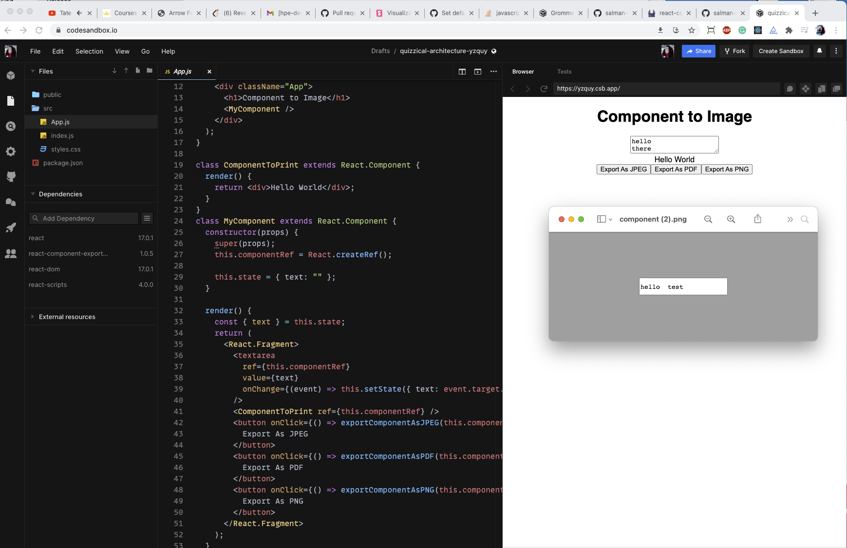
Answered 2021-Mar-03 at 20:50I think that the issue lay in the way the image is being exported. I created a quick test using only 'textarea' of HTML instead of the Grommet TextArea component and the issue still occurs:
I've verified that the behavior you've described is the expected behavior from react-component-export-image package by running the HTML example on their demo app, and it seems that this is their core functionality behavior. You might want to file an enhancement request that asks to support multiline screenshots. Here is the screenshot example from running the HTML example on their demo app:
QUESTION
I am using grommet library for my web app. I want to know how can I avoid showing borders below FormFields and other controls such as Accordions.
I have created a sandbox that demonstrates the problem and allows for testing any recommendations.
https://codesandbox.io/s/grommet-accordion-issue-v7u5y?file=/index.js
I have set the Accordion theme value to hide the border but I still see and I see no such setting on a FormField.
...ANSWER
Answered 2021-Feb-22 at 14:56Since both Accordion and FormField are considered interactive elements that should be accessible via keyboard, the bottom border is needed for accessibility indication when focusing on the element (focus indication is the green border you see as you use the Tab keyboard through navigating between the user interface or when the element has focus).
That being said, you can always set the color of the border to 'transparent' so it won't be visible, this will maintain the accessibility standards of the components yet the border itself wouldn't be visual on the UI.
I tried the following theme on your code snippet and it seems to do the trick as expected:
Community Discussions, Code Snippets contain sources that include Stack Exchange Network
Vulnerabilities
No vulnerabilities reported
Install grommet
Support
Reuse Trending Solutions
Find, review, and download reusable Libraries, Code Snippets, Cloud APIs from over 650 million Knowledge Items
Find more librariesStay Updated
Subscribe to our newsletter for trending solutions and developer bootcamps
Share this Page