responsiveness | Responsive style tools for ReactJS | Email library
kandi X-RAY | responsiveness Summary
kandi X-RAY | responsiveness Summary
Responsive style tools for ReactJS.
 Support
 Quality
 Security
 License
 Reuse
Reuse
Top functions reviewed by kandi - BETA
Currently covering the most popular Java, JavaScript and Python libraries. See a Sample of responsiveness
responsiveness Key Features
responsiveness Examples and Code Snippets
Community Discussions
Trending Discussions on responsiveness
QUESTION
I have xml design with a Linear layout as root and inside this constraint layout is used. I have an issue (this) in responsiveness while using the layout validator. Please suggest me.
//LinearLayout and ConstraintLayout
...ANSWER
Answered 2021-Jun-11 at 22:00try weightSum in Linear layout and in it's child you can set the value of layout_weight.
For example: if you set the value of weightSum is equal to 10 then you can divide it's child like textview and imageview etc is equal to 6 and 4 respectively which is equal to 10.
for more help read this article
QUESTION
I'm making a bubble map similar to this one: https://observablehq.com/@d3/bubble-map
Everything is working except that my smaller bubbles are not always showing on top of the larger ones. I can't see why, as I've sorted the data before drawing the circles. Can anyone see what I'm doing wrong?
Here is a plunker: https://plnkr.co/edit/JKWeQKkhN2TQwvNZ?open=lib%2Fscript.js
Code is below. The other files are too large for stack overflow but can be accessed via the Plunker.
...ANSWER
Answered 2021-Jun-08 at 00:26I would suggest you to split your data to a couple separate datasets grouped by size and create distinct group (g element) for each one. This will also fix issues with circles highlighting.
I slightly updated your plunker to make it work as described (check the lines 91-167) https://plnkr.co/edit/rayo5IZQrBqfqBWR?open=lib%2Fscript.js&preview
Also check the raise and lower methods. They might be a good replacement for your moveToFront and moveToBack methods.
https://riptutorial.com/d3-js/example/18029/svg--the-drawing-order
QUESTION
I have a flex-row of elements (e.g. two lines with flex-wrapped). When I click one of those elements a popup (green box) should be opened directly under this element (that's why I need an absolute positioning) and those popups should all have the same width (independent of which element is clicked).
The problem is since this absolute positioned div starts just under the clicked element, the starting point of this popup also varies on the x-axis. But I want all the popups start at the same point horizontally.
https://jsfiddle.net/h8f73Lpm/24/
This is what I currently have:
This is what I want to achieve, when I click on an element in the first row:
.. and when i click on an element on the second row:
This is a simplified version of my situation. Since we also have to consider the responsiveness the actual number of rows and elements vary. I would prefer a css-only solution.
...ANSWER
Answered 2021-Jun-07 at 14:52should be opened directly under this element (that's why I need an absolute positioning)
Can be achieve without position:absolute
Here is an idea using CSS grid where you add the pop-up element after the selected one not inside it:
QUESTION
I've been looking into my contact page on this website I'm creating and I'm trying to my text line up beside my icon but I can't seem to line it up properly. Here Is what I'm looking for. I've been trying to look through it and I'm getting a lot of struggles if possible thank you for the help
Issue via picture
...ANSWER
Answered 2021-Jun-07 at 13:22use bootstrap
QUESTION
I am trying to make a responsive navbar in react-bootstrap. Once I get down to h4, i want to start normal word wrapping, but no matter what, the h4 text goes outside the div container on the right when I try to test it's responsiveness in chrome. The nav-bar hovers above a dynamic map which is why the z-value is 2. Here is the js file:
...ANSWER
Answered 2021-Jun-03 at 04:33add this className to h4:
QUESTION
Trying to make the following code snippet work without JavaScript.
...ANSWER
Answered 2021-Jun-02 at 19:58If you use writing-mode instead rotate() , it's easier to handle, no need to set an average height:
https://codepen.io/gc-nomade/pen/poeaKXW
QUESTION
I'm creating this website for a company for my student co-op and I had this header made for my website and when I made it, it worked completely fine. Now when I check on my phone I press the services button for my dropdown menu and it doesn't come down, but when I try on the google chrome dev responsive tool, I can click the drop down menu but I also cant unclick the menu. I understand that I have a lot of code written in my CSS file, I do have stuff labeled though like header/home page.
My Issue:
When I click on my responsive navbar when it's resized to a smaller ratio. I click the bar and my nav menu pulls up but when I click on my services drop down menu It doesn't come down, Although it works on google chrome responsive dev tools. But when I click the services button and it works the dropdown wont go away when I click it again, how can I fix this? Majority of my navbar is labeled "Header" in my css file. I decided to put my whole file in as maybe something is over writing it but I have no clue it is?
HTML
...ANSWER
Answered 2021-Jun-02 at 16:42Here is what I have done: This is a link because there was to much code to put in the snippet. https://jsfiddle.net/Allan_StackoverFlow/stygwvx7/3/
Javascript:
QUESTION
When using tailwind responsive classes (ex: md:my-auto, focus:ring-0, focus:outline-none) in svelte kit component style tags, I get the following error:
ANSWER
Answered 2021-May-31 at 00:36It looks like you need to add a Svelte preprocessor to handle your PostCSS syntax (which Tailwind uses since it's a PostCSS plugin). Since you already have svelte-preprocess installed in your package.json, you only need to add postcss-load-config to allow svelte-preprocess to find your postcss.config.js.
Install postcss-load-config with:
QUESTION
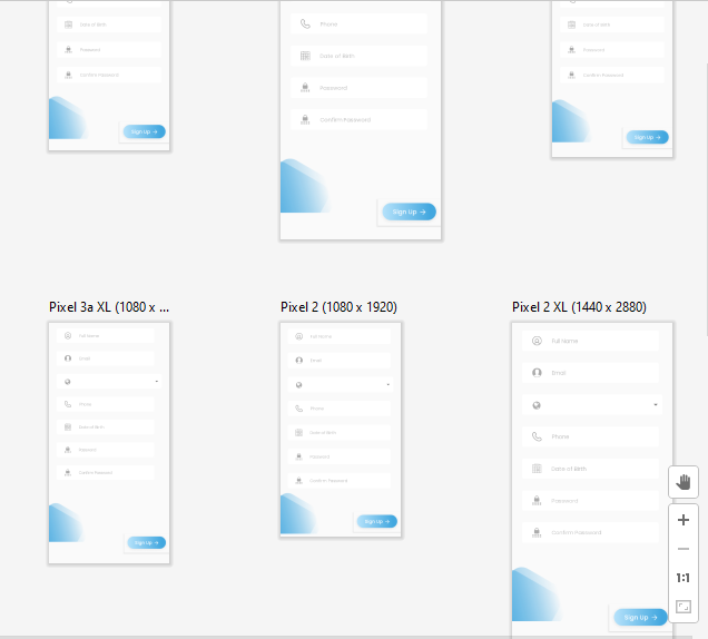
I am testing an application written in React.js for responsiveness on mobile devices. Hence my request to you, to test the application from this angle and share your thoughts on what can be improved. Certainly I want to improve the performance of the application, so that it loads faster. Is it enough to reduce the weight of photos and add lazyloading atribute to some photos?
...ANSWER
Answered 2021-May-30 at 16:12THIS IS TESTED ON A SMALL WINDOW SIMULATING MOBILE CLIENTS
Two problems here on this part. First, the text in the button is not properly displayed, and secondly, not sure if it is done on purpose, but the design of overlapping white text on a light background makes it a bit hard for people to see.
Over here, the line is sitting on top of the button on smaller screens and it is hovering over some of the content. Say you are clicking that button in the center, it doesn't work because there is this line on top of it, and that might not be something you want:
And here, your image is overflowing on the x axis:
Finally, this navigation bar on mobile devices is positioned absolutely on top of the screen, and I'm not sure if that's what you were planning to do, I recommend sticking it on to the screen such that even when the user scrolls, it's still there, fully exposed and what this does is that, the user doesn't have to scroll all the way to the top to find that navigation bar.
But, overall, this looks quite good and the color scheme really suites the theme.
QUESTION
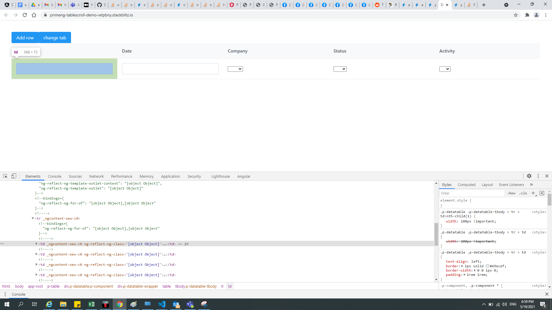
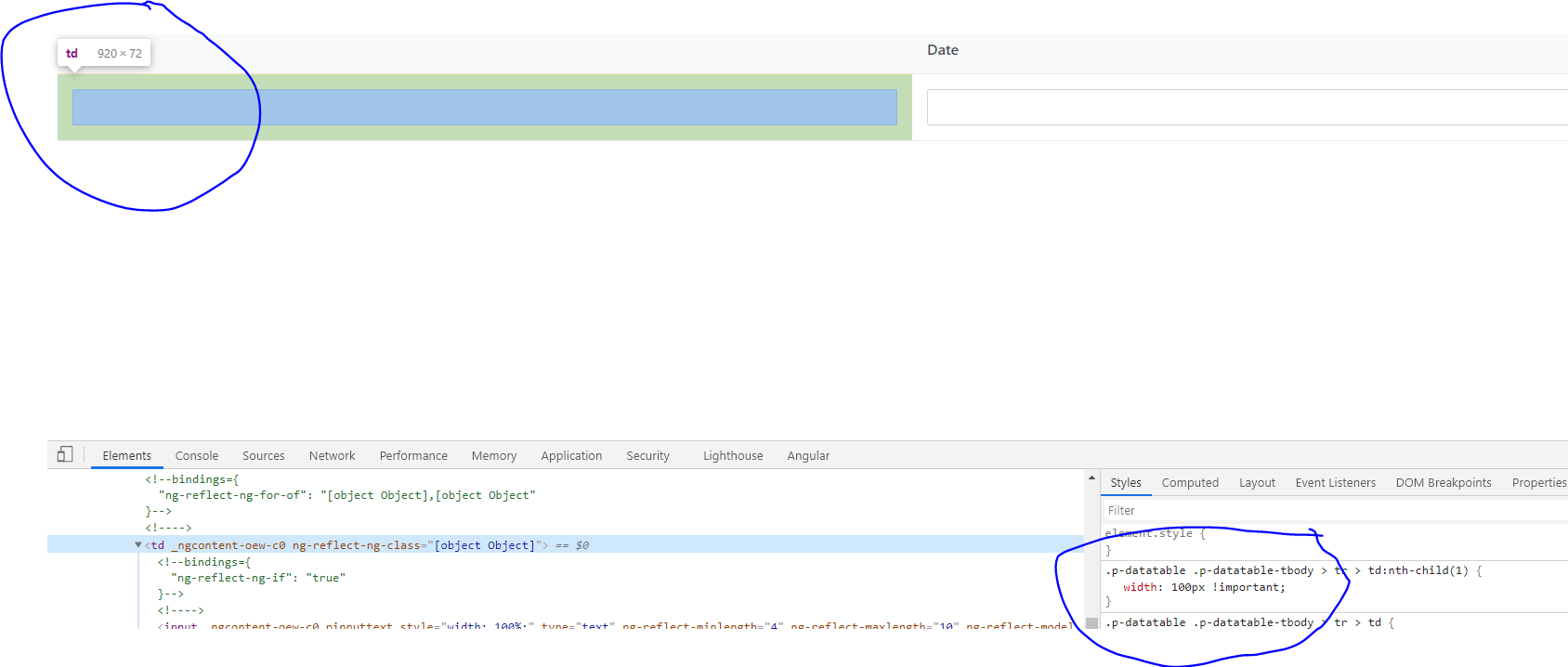
I am trying to fix the width of the first column in the primeNG table but somehow it is overriding my CSS even though it is showing while inspecting the element.
Basically, I am looking for CSS in which by changing the tab the first column of the table will have a fixed width no matter what is the size of all columns.
I have tried following way by defining fixed width for the first child but it is taking based width:100%.
In the above image, you can see the size is coming as 368 even though it is 100px defined.
Same when I change the tab, the width is coming as 920 even 100px is fixed.
Is there any way I can define fixed-width 100px with having table width:100% as I don't want to break responsiveness?
Below is reproducible example for reference:
...ANSWER
Answered 2021-May-21 at 04:23I think the problem is just that your selector for the th element is slightly incorrect. You have:
Community Discussions, Code Snippets contain sources that include Stack Exchange Network
Vulnerabilities
No vulnerabilities reported
Install responsiveness
Support
Reuse Trending Solutions
Find, review, and download reusable Libraries, Code Snippets, Cloud APIs from over 650 million Knowledge Items
Find more librariesStay Updated
Subscribe to our newsletter for trending solutions and developer bootcamps
Share this Page