design-system | Salesforce Lightning Design System | REST library
kandi X-RAY | design-system Summary
kandi X-RAY | design-system Summary
Welcome to the source code repository for Salesforce Lightning Design System, brought to you by Salesforce UX.
 Support
 Quality
 Security
 License
 Reuse
Reuse
Top functions reviewed by kandi - BETA
- Removes surrounding parentheses around a value .
- Creates and compiles the release notes
- Find the fallback value of a variable
- Highlight lines of a given block .
- Parse markdown - line notes
- Apply a hash to the current location .
- Splits an object into a notes array
- Adds a list of hook to the list
- Ask user for the command
- Get the release date
design-system Key Features
design-system Examples and Code Snippets
Community Discussions
Trending Discussions on design-system
QUESTION
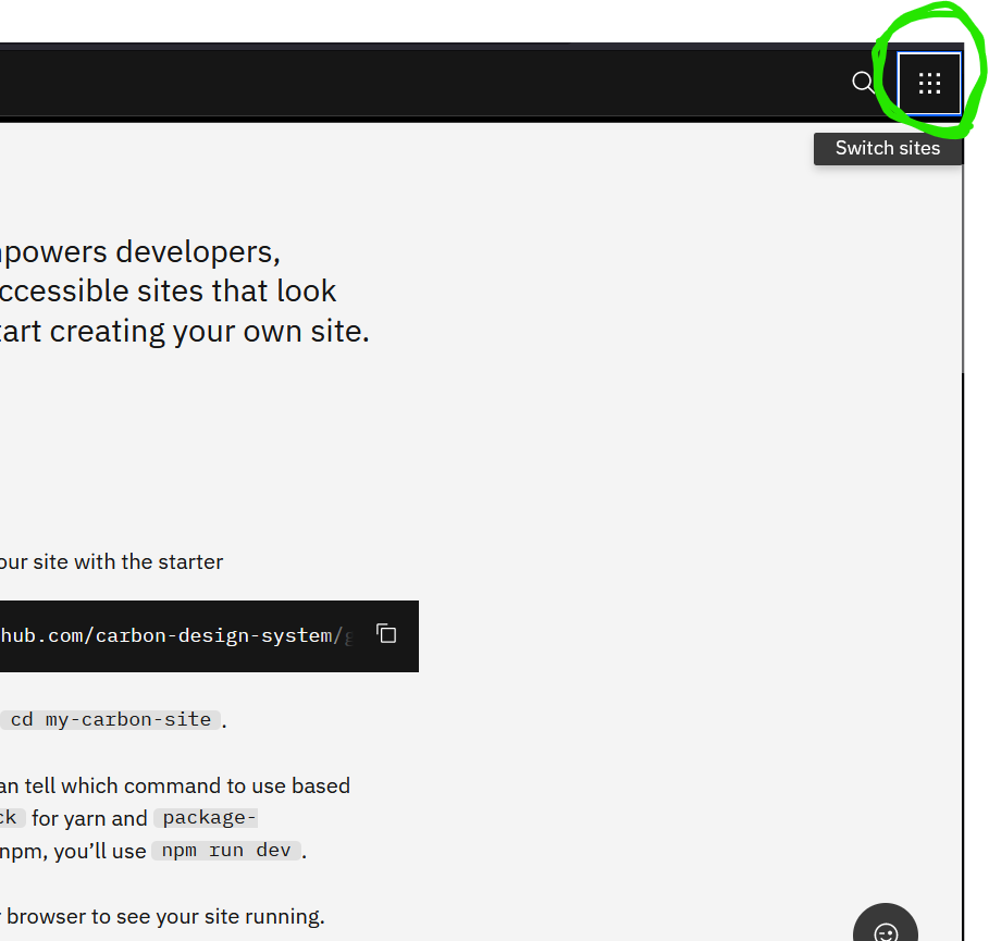
I am using a gatsby starter gatsby-theme-carbon. It has a switcher component whose code is available here. It looks like this Switcher screenshot.
How do I disable the Switcher completely using component shadowing ? ( i.e. I don't want the Switcher at all in my website).
Thanks in advance for the help.
...ANSWER
Answered 2021-Jun-05 at 09:50As you can see in Shadowing in Gatsby themes docs:
This feature allows users to replace a file in the
srcdirectory that is included in the webpack bundle with their own implementation. This works for React components, pages insrc/pages, JSON files, TypeScript files, as well as any other imported file (such as.css) in your site.
The shadowing API uses a deterministic file structure approach to know which component should or shouldn't be rendered. In your case, you just can override the CSS props to display it as none, or you just shadow and return an empty component, since shadowing is used to extend Gatsby themes. Create a src/gatsby-theme-blog/components/Switcher/Switcher.js in your project and do something like:
QUESTION
One of the values rendered in my is a boolean. I'm following the "Advanced: Joined with Page Header" from the components page, and I don't know how to render it correctly and without raising errors in my browser console. Here is my current code:
...ANSWER
Answered 2021-May-21 at 14:04you can use a hook for initialize your stringVal before the request..
QUESTION
So i'm building a design system for this company and the component system is displayed correctly in the design system storybook. But when I import it in the consumer app I get the following error
...ANSWER
Answered 2021-May-04 at 13:57I've had a similar issue when developing a component library using storybook and emotion/styled-components. The issue was that I was using the styled-components' ThemeProvider from the consumer app, as you did in your _app.js. The solution was to create and export a custom ThemeProvider on the component library, using the library's styled-component package, like so:
QUESTION
I'm working on a WPF application and I would like to style it according to Fluent Design. It seems that most aspects (responsive layout, navigation etc.) can be achieved using standard WPF mechanisms, however such features as acrylic effect and reveal highlight are quite difficult to implement in WPF.
I found certain solutions with SetWindowCompositionAttribute (Adding the "Aero Glass" blur to your Windows 10 apps), but this attribute is not documented and I'm not sure if this is the best solution. Additionally, if I understand things right, it doesn't allow me to control the acrylic color.
Is there a good way to implement fluent design in WPF?
...ANSWER
Answered 2021-Apr-16 at 07:03Unfortunately, standard WPF controls don't provide an "official" way to implement the acrylic and reveal highlight effects.
You can try using third-party libraries for this. For example DevExpress controls, which include both acrylic and reveal highlight features: Fluent Design Support.
The screenshot below illustrates what you can get:
You can download this example at How to Create a Unique Design for a WPF View using Appearance Options.
Another possible solution is to use the FluentWPF package.
QUESTION
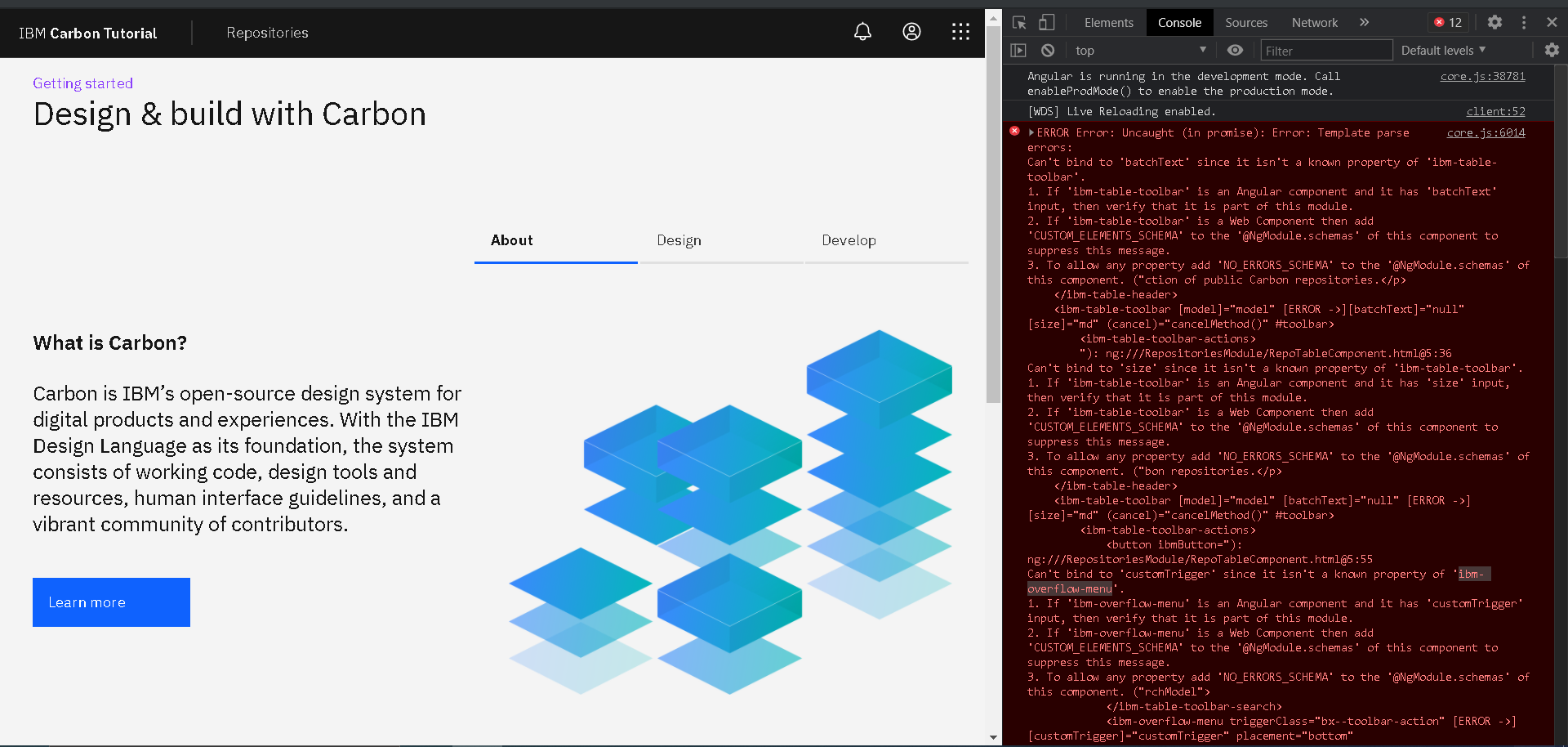
I'm following the Carbon Design System Angular Tutorial. I'm trying to increment the repositories page implemented during the tutorial. My goal is to use the 'with toolbar' from table angular stories.
I'm facing these runtime property's binding errors regarding the ibm-table-toolbar and ibm-overflow-menu. See the image below:
repositories.module.ts
...ANSWER
Answered 2021-Mar-22 at 01:03After few days of smashing my keyboard with my own head. I've finally got an insight, and decide to further investigate the code of the problematic components (on my local node modules). Of course, these attributes are not expected, because of the version I were installed. So in the end was only a matter of updating the carbon angular components dependecy.
QUESTION
This is my react component:
...ANSWER
Answered 2021-Feb-22 at 19:23The problem is you arrow function
QUESTION
If, as a thought experiment, I were to write my own createElement implementation for JSX, what might support for implicit context look like?
In particular, I can't figure out how with the limited means of JSX's createElement signature, contexts can be independent for different subtrees. (It appears React's Context handling has become more elaborate in recent versions; I'm mostly interested in the seemingly more straightforward mechanisms of earlier versions.)
This might be used to automatically determine heading levels, for example:
...ANSWER
Answered 2021-Feb-15 at 16:24A very nice question, that shows how different is the concept of creating React Elements to actually executing the render functions (either the .render method of class components or simply the main body of a functional component).
In JSX itself (which is just React.createElement(…)) there‘s no concept of “context” at all. It comes into existance only when the components are rendered. It is indeed a duty of the React Renderer (such as React DOM or React Native) to actually implement Context APIs.
If you remove the ability to store states and to update the UI you are left with a minimal React implementation that only “renders once”, but perfectly fine to understand the problem at hand.
Everytime the React Renderer needs to render a React Elements tree (such as one built with JSX) it passes every single element and transforms it into a DOM structure, but when it encounters a component node (not a “native” element) it needs to render it to obtain its React Element sub tree, and swap the original node with it.
It’s in this specific moment that React can keep track of which Context values to pass to which components, since it is traversing the tree.
So, to answer directly your question, you can’t implement context in the “element creation phase”, inside your JSX implementation, you need to do it in a subsequent phase when you can traverse the tree.
If you were trying to build an “immediate JSX” you probably have something like this:
QUESTION
I have a monorepo that contains a design-system made with styled components. In this design system I have a Heading component that takes a 'level' prop to adjust the CSS of the heading.
Heading
...ANSWER
Answered 2021-Jan-21 at 12:10You're close! JSX.IntrinsicElements is an interface whose keys are the labels of the HTML tags. It itself is not a union of all HTML tags.
That means that all you need to do is
QUESTION
Is it possible to get the pre-processed value of ng-content?
I am building design-system docs and want to display the example code without repeating myself
html:
...ANSWER
Answered 2021-Jan-10 at 08:44This doesn't necessarily answer your question about getting the pre-processed HTML from ng-content. However this approach can be used to solve your issue about displaying the HTML as an example. You can import the raw html as a string and use it as a variable. What I like to do is then create a component or multiple components that demonstrates usage of some component I'm documenting.
This is kind of a lot, so I put it all in a StackBlitz to try and demonstrate.
Create a file right in the src directory called typings.d.ts that allows us to import html files as text.
QUESTION
I'm using the react library of carbon design charts and I'm having difficulties setting custom colors using getFillColor function in the chart options properties :
ANSWER
Answered 2020-Nov-08 at 08:22I've found out that from the history, there was a change that needs the color.scale property to be specified in the chart options:
Community Discussions, Code Snippets contain sources that include Stack Exchange Network
Vulnerabilities
No vulnerabilities reported
Install design-system
Clone the repository down locally.
cd into the project and run npm install to install all project dependencies.
Support
Reuse Trending Solutions
Find, review, and download reusable Libraries, Code Snippets, Cloud APIs from over 650 million Knowledge Items
Find more librariesStay Updated
Subscribe to our newsletter for trending solutions and developer bootcamps
Share this Page