material-ui | formerly Material-UI ) is the React UI library | User Interface library
kandi X-RAY | material-ui Summary
Support
Quality
Security
License
Reuse
Currently covering the most popular Java, JavaScript and Python libraries. See a Sample Here
material-ui Key Features
material-ui Examples and Code Snippets
function SelectWrapped(props) {
const { classes, ...other } = props;
return (
);
}
const customStyles = {
control: () => ({
display: "flex",
alignItems: "center",
border: 0,
height: "auto",
background: "transparent",
"&:hover": {
boxShadow: "none"
}
}),
menu: () => ({
backgroundColor: "white",
boxShadow: "1px 2px 6px #888888", // should be changed as material-ui
position: "absolute",
left: 0,
top: `calc(100% + 1px)`,
width: "100%",
zIndex: 2,
maxHeight: ITEM_HEIGHT * 4.5
}),
menuList: () => ({
maxHeight: ITEM_HEIGHT * 4.5,
overflowY: "auto"
})
};
class Option extends React.Component {
handleClick = event => {
this.props.selectOption(this.props.data, event);
};
render() {
const { children, isFocused, isSelected, onFocus } = this.props;
console.log(this.props);
return (
{children}
);
}
}
import { MuiThemeProvider, createMuiTheme } from '@material-ui/core/styles';
const fontSize = 14, // px
// Tell Material-UI what's the font-size on the html element.
// 16px is the default font-size used by browsers.
const htmlFontSize = 16,
const coef = fontSize / 14;
const theme = createMuiTheme({
typography: {
pxToRem: size => `${(size / htmlFontSize) * coef}rem`,
},
});
$ git clone https://github.com/mui-org/material-ui.git
$ cd material-ui
$ yarn
$ yarn docs:dev
// hocs/default-page.js
export default Page => class DefaultPage extends React.Component {
static getInitialProps(ctx) {
// Ensures material-ui renders the correct css prefixes server-side
let userAgent
if (process.browser) {
userAgent = navigator.userAgent
} else {
userAgent = ctx.req.headers['user-agent']
}
// Check if Page has a `getInitialProps`; if so, call it.
const pageProps = Page.getInitialProps && Page.getInitialProps(ctx);
// Return props.
return { ...pageProps, userAgent }
}
...
render() {
return (
);
}
}
// pages/index.js
import defaultPage from '../hocs/default-page';
const Page = () => Hello World;
Page.getInitialProps = () => { ... };
export default defaultPage(Page);
// Also works for proper components:
export default defaultPage(class MyPage extends React.Component {
static getInitialProps() {
...
}
render() {
...
}
});
// drawer.css
@media(minWidth: 780px) {
.drawer {
width: '90%';
}
}
//DrawerComponent.js
import '/path/to/your/drawer.css';
//...
render() {
return ()
}
// drawer.css
@media (min-width: 780px) {
.drawer {
width: 90% !important;
}
}
//DrawerComponent.js
import '/path/to/your/drawer.css';
//...
render() {
return ()
}
// drawer.css
@media (min-width: 780px) {
.drawer {
width: 90% !important; // material-ui uses vw so 90vw works too
transform: translate(-100%, 0px) !important; // translate(-90vw, 0px)
}
.drawer.open {
transform: translate(0, 0px) !important;
}
}
//DrawerComponent.js
import '/path/to/your/drawer.css';
//...
render() {
return (
)
}
import { create } from 'jss';
import rtl from 'jss-rtl';
import JssProvider from 'react-jss/lib/JssProvider';
import { createGenerateClassName, jssPreset } from '@material-ui/core/styles';
// Configure JSS
const jss = create({ plugins: [...jssPreset().plugins, rtl()] });
// Custom Material-UI class name generator.
const generateClassName = createGenerateClassName();
function RTL(props) {
return (
{props.children}
);
}
// assuming material-ui and react-redux only
function getDisplayName(component) {
function getName(type) {
let str = "";
if (type.displayName) {
str += "(" + type.displayName;
} else if (type.name) {
str += "(" + type.name;
}
if (type.Naked && getName(type.Naked)) {
str += getName(type.Naked);
} else if (type.WrappedComponent && getName(type.WrappedComponent)) {
str += getName(type.WrappedComponent);
} else if (type.render && getName(type.render)) {
str += getName(type.render);
} else if (typeof type === "string") {
str += type;
} else if (type.type && getName(type.type)) {
str += getName(type.type);
}
return str;
}
let currStr = getName(component);
const openParenCount = Array.from(currStr).filter(el => el === "(").length;
const closeParenCount = Array.from(currStr).filter(el => el === ")").length;
return (
currStr + [...Array(openParenCount - closeParenCount)].map(el => ")").join("")
)
}
Trending Discussions on material-ui
QUESTION
I have been stock on this error on my project when I add "proxy": "http://localhost:6000"
in my package.json.
This is the error response after yarn start.
Invalid options object. Dev Server has been initialized using an options object that does not match the API schema.
- options.allowedHosts[0] should be a non-empty string. error Command failed with exit code 1. info Visit https://yarnpkg.com/en/docs/cli/run for documentation about this command.
But everything is fine when I remove the "proxy": "http://localhost:6000"
.
This is on my package.json:
{
"name": "client",
"version": "0.1.0",
"private": true,
"dependencies": {
"@material-ui/core": "^4.12.3",
"@testing-library/jest-dom": "^5.16.1",
"@testing-library/react": "^12.1.2",
"@testing-library/user-event": "^13.5.0",
"axios": "^0.24.0",
"moment": "^2.29.1",
"react": "^17.0.2",
"react-dom": "^17.0.2",
"react-file-base64": "^1.0.3",
"react-redux": "^7.2.6",
"react-scripts": "5.0.0",
"redux": "^4.1.2",
"redux-thunk": "^2.4.1",
"web-vitals": "^2.1.2"
},
"scripts": {
"start": "react-scripts start",
"build": "react-scripts build",
"test": "react-scripts test",
"eject": "react-scripts eject"
},
"eslintConfig": {
"extends": [
"react-app",
"react-app/jest"
]
},
"browserslist": {
"production": [
">0.2%",
"not dead",
"not op_mini all"
],
"development": [
"last 1 chrome version",
"last 1 firefox version",
"last 1 safari version"
]
},
"proxy": "http://localhost:6000"
}
ANSWER
Answered 2021-Dec-19 at 16:06Here is a workaround. Delete "proxy": "http://localhost:6000". Install package http-proxy-middleware with command npm install http-proxy-middleware --save. Create a file setupProxy.js inside your src folder. Add these lines inside:
const { createProxyMiddleware } = require('http-proxy-middleware');
module.exports = function(app) {
app.use(
'/api',
createProxyMiddleware({
target: 'http://localhost:6000',
changeOrigin: true,
})
);
};
Now, run your app. It should work.
QUESTION
I'm following the Sort Model documentation (https://material-ui.com/components/data-grid/sorting/#basic-sorting) and am using sortModel
and onSortModelChange
exactly as used in the documentation. However, I'm getting an infinite loop immediately after loading the page (I can tell this based on the console.log).
What I've tried:
- Using useCallback within the onSortChange prop
- Using server side sorting (https://material-ui.com/components/data-grid/sorting/#server-side-sorting)
- Using
if (sortModel !== model) setSortModel(model)
within the onSortChange function.
I always end up with the same issue. I'm using Blitz.js.
My code:
useState:
const [sortModel, setSortModel] = useState([
{
field: "updatedAt",
sort: "desc" as GridSortDirection,
},
])
rows definition:
const rows = currentUsersApplications.map((application) => {
return {
id: application.id,
business_name: application.business_name,
business_phone: application.business_phone,
applicant_name: application.applicant_name,
applicant_email: application.applicant_email,
owner_cell_phone: application.owner_cell_phone,
status: application.status,
agent_name: application.agent_name,
equipment_description: application.equipment_description,
createdAt: formattedDate(application.createdAt),
updatedAt: formattedDate(application.updatedAt),
archived: application.archived,
}
})
columns definition:
const columns = [
{ field: "id", headerName: "ID", width: 70, hide: true },
{
field: "business_name",
headerName: "Business Name",
width: 200,
// Need renderCell() here because this is a link and not just a string
renderCell: (params: GridCellParams) => {
console.log(params)
return
},
},
{ field: "business_phone", headerName: "Business Phone", width: 180 },
{ field: "applicant_name", headerName: "Applicant Name", width: 180 },
{ field: "applicant_email", headerName: "Applicant Email", width: 180 },
{ field: "owner_cell_phone", headerName: "Ownership/Guarantor Phone", width: 260 },
{ field: "status", headerName: "Status", width: 130 },
{ field: "agent_name", headerName: "Agent", width: 130 },
{ field: "equipment_description", headerName: "Equipment", width: 200 },
{ field: "createdAt", headerName: "Submitted At", width: 250 },
{ field: "updatedAt", headerName: "Last Edited", width: 250 },
{ field: "archived", headerName: "Archived", width: 180, type: "boolean" },
]
Rendering DataGrid and using sortModel/onSortChange
`MuiDataGrid-row--${params.getValue(params.id, "status")}`}
rows={rows}
columns={columns}
pageSize={10}
components={{
Toolbar: GridToolbar,
}}
filterModel={{
items: [{ columnField: "archived", operatorValue: "is", value: showArchived }],
}}
sortModel={sortModel}
onSortModelChange={(model) => {
console.log(model)
//Infinitely logs model immediately
setSortModel(model)
}}
/>
Thanks in advance!
ANSWER
Answered 2021-Aug-31 at 19:57I fixed this by wrapping rows
and columns
in useRefs and used their .current
property for both of them. Fixed it immediately.
QUESTION
I was using the Material UI Timepicker
but after updating to MUI 5 it is not working anymore. I updated everything to @next
and @material-ui/core
(version 5.0.0-beta.5) and @material-ui/lab
(version: 5.0.0-alpha.44).
ANSWER
Answered 2021-Oct-06 at 05:51If you copy the Timepicker
code from the MUI docs, you also need to install the lab package which contains the adapter code to integrate with date-fns
. See the requirements here. For reference, you can see the package.json file from the live demo.
npm i @mui/lab
QUESTION
I have been working on Material-UI and trying to use a color system throughout the palette. There seems to be some issue while compilation although it works perfectly in run time. Can someone help me resolve following error:
Error:
Property 'main' does not exist on type 'PaletteColorOptions'.
Property 'main' does not exist on type 'Partial'.(2339)
Here is stackblitz as well: https://stackblitz.com/edit/react-up6bjl-hx1bbh?file=demo.tsx
Code:
import * as React from 'react';
import {
createTheme,
Theme,
ThemeProvider,
PaletteOptions
} from '@material-ui/core/styles';
import Button from '@material-ui/core/Button';
declare module '@material-ui/core/styles' {
interface SimplePaletteColorOptions {
lighter?: string;
darker?: string;
}
interface PaletteColor {
lighter?: string;
darker?: string;
}
}
const Default = () : PaletteOptions => {
return {
primary: {
lighter: '#ddd',
light: '#ddd',
main: '#ddd',
dark: '#ddd',
darker: '#ddd'
},
};
};
export default function CustomColor() {
const defaultColors = Default();
const palette: PaletteOptions = {
...defaultColors,
divider: defaultColors.primary?.main, // error in compile. Cannot find 'main'
};
const theme: Theme = createTheme({
palette
});
console.log(theme.palette.primary.light);
return (
neutral
);
}
ANSWER
Answered 2022-Jan-18 at 02:50The TypeScript error is unrelated to your module augmentation. The issue is just that defaultColors
is of type PaletteOptions
. PaletteOptions
defines primary to be of type PaletteColorOptions.
Here's the definition of PaletteColorOptions and the types it is built from:
export type PaletteColorOptions = SimplePaletteColorOptions | ColorPartial;
export interface SimplePaletteColorOptions {
light?: string;
main: string;
dark?: string;
contrastText?: string;
}
export type ColorPartial = Partial;
export interface Color {
50: string;
100: string;
200: string;
300: string;
400: string;
500: string;
600: string;
700: string;
800: string;
900: string;
A100: string;
A200: string;
A400: string;
A700: string;
}
So the TypeScript compiler knows that defaultColors.primary
is either SimplePaletteColorOptions
or ColorPartial
, but it doesn't know which. You are then referencing defaultColors.primary.main
, but that isn't guaranteed to be present unless the type of defaultColors.primary
is SimplePaletteColorOptions
.
You can fix this by using a more specific return type for the Default
function that lets TypeScript know that the type of primary
is SimplePaletteColorOptions
:
interface DefaultPaletteOptions extends PaletteOptions {
primary?: SimplePaletteColorOptions;
}
const Default = (): DefaultPaletteOptions => {
return {
primary: {
lighter: "#ddd",
light: "#ddd",
main: "#ddd",
dark: "#ddd",
darker: "#ddd"
}
};
};
Related answers:
QUESTION
I have a project and with this project I have a login page and I want to use "RouteComponentProps", but I got this error:
Module '"react-router-dom"' has no exported member 'RouteComponentProps'.
And I tried to import it via "react-router", but it appeared to me:
Module '"react-router"' has no exported member 'RouteComponentProps'.
How can I solve the problem?
This is part of the file I used "RouteComponentProps":
signin.tsx:
import { RouteComponentProps } from 'react-router-dom';
interface Props {
history: RouteComponentProps['history']
}
package.json:
{
"name": "my-app",
"version": "0.1.0",
"private": true,
"dependencies": {
"@material-ui/core": "^4.12.3",
"@material-ui/icons": "^4.11.2",
"@material-ui/styles": "^4.11.4",
"@reach/router": "^1.3.4",
"@testing-library/jest-dom": "^5.11.4",
"@testing-library/react": "^11.1.0",
"@testing-library/user-event": "^12.1.10",
"@types/jest": "^26.0.24",
"@types/node": "^12.20.37",
"@types/react": "^17.0.37",
"@types/react-dom": "^17.0.11",
"@types/react-redux": "^7.1.20",
"axios": "^0.24.0",
"history": "^5.1.0",
"react": "^17.0.2",
"react-dom": "^17.0.2",
"react-redux": "^7.2.6",
"react-router": "^6.1.1",
"react-router-dom": "^6.1.1",
"react-scripts": "4.0.3",
"redux": "^4.1.2",
"redux-devtools-extension": "^2.13.9",
"redux-thunk": "^2.4.1",
"thunk": "0.0.1",
"typescript": "^4.5.2",
"web-vitals": "^1.0.1"
},
"scripts": {
"start": "react-scripts start",
"build": "react-scripts build",
"test": "react-scripts test",
"eject": "react-scripts eject"
},
"eslintConfig": {
"extends": [
"react-app",
"react-app/jest"
]
},
"browserslist": {
"production": [
">0.2%",
"not dead",
"not op_mini all"
],
"development": [
"last 1 chrome version",
"last 1 firefox version",
"last 1 safari version"
]
},
"devDependencies": {
"@types/react-router": "^5.1.17",
"@types/react-router-dom": "^5.3.2",
"miragejs": "^0.1.43"
}
}
ANSWER
Answered 2021-Dec-16 at 17:05react-router
v6 doesn't use RouteComponentProps
anymore. Here are some links with examples on how to change route and how to use params on v6 with some links where you can find more informations:
For changing route (old history.push)
If you want to change the route after the login is successful react-router docs specify
In v6, this app should be rewritten to use the navigate API. Most of the time this means changing useHistory to useNavigate and changing the history.push or history.replace callsite.
So basically instead of having somthing like
...
function handleClick() {
history.push("/home");
}
...
use something like:
// This is a React Router v6 app
import { useNavigate } from "react-router-dom";
function App() {
let navigate = useNavigate();
function handleClick() {
navigate("/home");
}
...
For link params
According to this link when you upgrate to React Router v6 you should just use import {useParams} from 'react-router-dom';
+ const params = useParams();
so something like:
import React from 'react';
import {useParams} from 'react-router-dom';
const Component: React.FC = (): JSX.Element => {
const params = useParams();
return <>Link ID parameter === "{params.id}";
}
Edit regarding types (for ts): You can find more information about the interfaces here (for useNavigate) and here (for useParams)
QUESTION
I am trying to navigate to "/quiz" when Start Quiz button is clicked.
However when I compile my code I am getting the following error on the website application: [Home] is not a component. All component children of must be a or
I am new to react and if anyone can help me I would be grateful!
Here is my code for App.js:
import { BrowserRouter, Routes, Route } from "react-router-dom";
import Footer from "./components/Footer/Footer";
import Header from "./components/Header/Header";
import Home from "./Pages/Home/Home";
import Quiz from "./Pages/Quiz/Quiz";
import "./App.css";
function App() {
return (
);
}
export default App;
Here is my code for Home.js:
import { Button } from "@material-ui/core";
import { Container } from "@material-ui/core";
import { useNavigate } from "react-router-dom";
import "./Home.css";
const Home = () => {
const navigate = useNavigate();
const sendSubmit = () => {
navigate("/quiz");
};
return (
Phishing Quiz
Do you think you can beat our phishing quiz?
{" "}
There are many social engineering attacks on internet however not all of
them are good enough to trick users. However there are some scams that
are identical to original websites and usually most of the users get
tricked by them.
Do you think you are smart enough to handle these attacks?
We are challenging you with our phishing quiz which will show you
examples of really good social engineering attacks on internet. We hope
you can pass!
""
Start Quiz
);
};
export default Home;
I only have empty code inside Quiz.js at the moment.
ANSWER
Answered 2021-Nov-23 at 03:20Only Route
or React.Fragment
are allowed to be children of the Routes
component, and vice-versa. You are already rendering a Home
component on the "/" path, so remove the extraneous component. It appears you are also using
react-router-dom
v6, so the Route
components no longer render components via a render
or component
prop, they now render components as JSX on the element
prop.
// <-- remove this
to
} />
} />
QUESTION
Could not find any related question in StackOverflow.
So, in box component, sx
prop is getting transformed, say from
to
but its not transforming in other components like ListSubheader
is transforming to
Manage
ANSWER
Answered 2021-Nov-18 at 18:14Check your component code, you might import the v4 component:
import ListItemText from "@material-ui/core/ListItemText";
In v5, MUI components are moved to a new package called @mui/material
import ListItemText from "@mui/material/ListItemText";
You can only use sx
in other components without configuration in MUI v5, if you're using v4 or the older beta versions of the v5, you have to create a wrapper component as explained from this section:
import {
compose,
spacing,
palette,
styleFunctionSx
} from "@material-ui/system";
import MuiListSubheader from "@material-ui/core/ListSubheader";
const styleFunction = styleFunctionSx(compose(spacing, palette));
const ListSubheader = styled(MuiListSubheader)(styleFunction);
In v5, you can use sx
directly from the components since they've been migrated to emotion
.
QUESTION
I've just upgraded from Material-UI v4 to v5 (now MUI). 
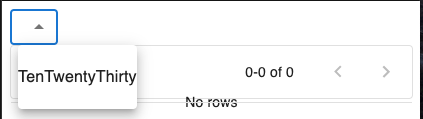
If I have a DataGrid
component and a component like a Select
component (a MenuItem
has issues too), the Select
component will not work properly. Some additional styles loaded by the DataGrid
interfere with it.
The example I'll show here is that values no longer dropdown, but are instead listed horizontally all smashed together. Note that the DataGrid
is intentionally empty for this demo.
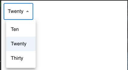
As opposed to the expected functionality like this:
I've put the code on CodeSandbox
Notice that "@mui/x-data-grid": "^4.0.0"
has a dependency on "@material-ui/core": "^4.12.3"
. I was/am uncomfortable with that, but it does have it listed as a dependency (unless I missed something somewhere).
Is there something I'm missing, or is there a bug in the newest version of DataGrid
I'm using? BTW, all of the the DataGrid
functionality in my actual application works fine.
For completeness, I'll also include the code here:
import React from "react";
import { render } from "react-dom";
import { DataGrid } from "@mui/x-data-grid";
import Select from "@mui/material/Select";
import MenuItem from "@mui/material/MenuItem";
function App() {
return (
Ten
Twenty
Thirty
{/* with DataGrid, Select will shown options on one line */}
{/* comment out DataGrid and the select will work */}
);
}
render(, document.querySelector("#root"));
The package.json file is:
{
"name": "mui-datagrid-isolation-issue",
"version": "5.0.0",
"description": "",
"keywords": [],
"main": "index.js",
"dependencies": {
"@emotion/react": "latest",
"@emotion/styled": "latest",
"@mui/material": "^5.0.1",
"@mui/styles": "^5.0.1",
"@mui/x-data-grid": "^4.0.0",
"@material-ui/core": "^4.12.3",
"react": "latest",
"react-dom": "latest"
}
}
ANSWER
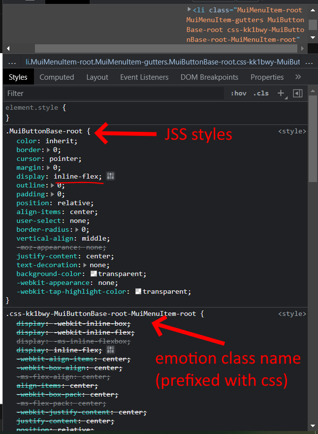
Answered 2021-Nov-09 at 06:35You're using v4 @mui/x-data-grid
which uses JSS while the MUI components are in v5 which uses emotion. The JSS styles from the old version overrides the emotion styles leading to unexpected result.
To fix it, install the next version (v5) of @mui/x-data-grid
so it can be compatible with MUI v5, and also remove @material-ui/core
v4 in your package.json
.
npm install @mui/x-data-grid@next
You can always look at the package.json file in the docs demo to see what a working project look like.
QUESTION
I am setting up storybook and for my translations I am using next-i18next
. This is How I set it up:
// .storybook/i18n.js
import i18n from 'i18next';
import { initReactI18next } from 'react-i18next';
i18n.use(initReactI18next).init({
fallbackLng: 'de',
debug: true,
});
export default i18n;
// .storybook/preview.js
import { StoreMall } from '../components/layouts/StoreMall';
import { I18nextProvider } from 'react-i18next';
import i18n from './i18n';
import { ThemeProvider } from '@material-ui/core/styles';
import { jamesTheme } from '../components/colors';
import { themes } from '@storybook/theming';
import CssBaseline from '@material-ui/core/CssBaseline';
export const parameters = {
// ...
};
export const decorators = [
(Story) => (
{Story()}
),
];
// .storybook/main.js
const path = require('path');
module.exports = {
stories: ['../components/**/*.stories.js', '../components/**/*.stories.mdx'],
addons: [
'@storybook/addon-links',
'@storybook/addon-essentials',
'storybook-dark-mode',
],
webpackFinal: async (config, { isServer }) => {
config.resolve.modules = [path.resolve(__dirname, '..'), 'node_modules'];
config.resolve.alias = {
...config.resolve.alias,
'@': path.resolve(__dirname, '../components'),
store: path.resolve(__dirname, '../utils/stores'),
dummy: path.resolve(__dirname, '../utils/dummy'),
};
if (!isServer) {
config.node = {
fs: 'empty',
};
}
return config;
},
};
And now anywhere where I use translation, it's not getting translated and this type of warning is being displayed in the console:
i18next::translator: missingKey de editor unlock_page_margins unlock_page_margins
This is the script in my package.json for starting storybook locally.
"storybook": "start-storybook -s ./public -p 6006",
Storybook is not set up to be viewed on a website yet.
The translations work when I run the dev server, just in storybook it's not working. I was following this guide to set it up: https://dev.to/justincy/using-next-i18next-in-storybook-3he9
ANSWER
Answered 2021-Nov-02 at 14:40I installed this package: https://www.npmjs.com/package/i18next-http-backend
And then in my i18n.js
file, I add the backend.
import i18n from 'i18next';
import { initReactI18next } from 'react-i18next';
import HttpApi from 'i18next-http-backend';
i18n
.use(HttpApi)
.use(initReactI18next).init({
fallbackLng: 'de',
debug: true,
});
export default i18n;
And now I am getting the translation in my storybook.
QUESTION
I'm trying to create a Material-UI Autocomplete
component that essentially just displays search results to the user. Some of the options' names will be duplicates, but they will all have unique IDs. I've been trying to fix the following warning for hours and I can't figure it out.
index.js:1 Warning: Encountered two children with the same key,
Name B
. Keys should be unique so that components maintain their identity across updates. Non-unique keys may cause children to be duplicated and/or omitted — the behavior is unsupported and could change in a future version.
I've tried adding a key={}
to numerous places throughout the code, all to no avail.
Code is attached below, and I'm quite new to this so any suggestions for how to improve the rest of the code generally would also be welcome.
const SearchField = () => {
const [open, setOpen] = React.useState(false)
const [searchQuery, setSearchQuery] = React.useState('')
const [searchResults, setSearchResults] = React.useState([])
const loading = true //later
const debounced = useDebouncedCallback(
async searchQuery => {
if (searchQuery) {
let result = await doSearch(searchQuery)
if (result.status === 200) {
setSearchResults(result.data)
} else {
console.error(result)
}
}
},
1000
)
const handleInputChange = e => {
if (e.target.value && e.target.value !== searchQuery) {
debounced(e.target.value)
setSearchQuery(e.target.value)
}
}
const options = [{
name: 'Name A',
id: 'entry_0597856'
},{
name: 'Name B',
id: 'entry_3049854'
},{
name: 'Name B',
id: 'entry_3794654'
},{
name: 'Name C',
id: 'entry_9087345'
}]
return (
setOpen(true)}
onClose={() => setOpen(false)}
loading={loading}
key={option => option.id}
options={options}
getOptionLabel={option => option.name}
renderOption={(props, option) => (
{option.name}
)}
renderInput={params => {
return (
{loading ? : null}
{params.InputProps.endAdornment}
)
}}
/>
)}
}
/>
)
}
ANSWER
Answered 2021-Oct-27 at 16:32You can define your own renderOption
that can return the list item with a correct key value. Your code complains about the duplicated keys because by default, Autocomplete
uses the getOptionLabel(option)
to retrieve the key:
{
return (
{option.name}
);
}}
renderInput={(params) => }
/>
If it still doesn't work, check your props order, you need to declare the key prop last, if you put it before the props provided by the callback:
Then it will be overridden by the props.key
from MUI. It should be like this:
Community Discussions, Code Snippets contain sources that include Stack Exchange Network
Vulnerabilities
No vulnerabilities reported
Install material-ui
v4.x (Migration from v4 to v5)
v3.x (Migration from v3 to v4)
v0.x (Migration to v1)
Support
Find, review, and download reusable Libraries, Code Snippets, Cloud APIs from over 650 million Knowledge Items
Find more librariesExplore Kits - Develop, implement, customize Projects, Custom Functions and Applications with kandi kits
Save this library and start creating your kit
Share this Page