design-system | 🗃 Storybook Design System | Frontend Framework library
kandi X-RAY | design-system Summary
kandi X-RAY | design-system Summary
Storybook Design System
 Support
 Quality
 Security
 License
 Reuse
Reuse
Top functions reviewed by kandi - BETA
Currently covering the most popular Java, JavaScript and Python libraries. See a Sample of design-system
design-system Key Features
design-system Examples and Code Snippets
Community Discussions
Trending Discussions on design-system
QUESTION
I try to add typeorm to a new angular-cli project, but as far as I add a reference to typeorm, I get an compiler-error.
...ANSWER
Answered 2022-Feb-24 at 07:07The problem was fixed in the new TypeORM Version (0.2.44) und the build now works without build errors.
Version: https://github.com/typeorm/typeorm/releases/tag/0.2.44
QUESTION
I'd like to know if there's anyway I'm able to customize the scss/html template of a Nebular Stepper component. I found out that you can customize some of the scss using Nebular Custom theming but I need to change things that don't have theme variables, like the Stepper Header (Completed step icon, number appearance.. etc) and Stepper connector (Appearance, size.. etc)..
I'm somewhat new to angular/nebular components, so I don't know how to customize the scss/html template of pre-made components, can anyone give me a hand?
...ANSWER
Answered 2022-Jan-19 at 14:38A better approach is to create your own theming in nebular instead of changing individual elements according to your need, but there is a way to achieve what you're trying as well.
To do that you'll need to find the classes related to the stepper, and then apply your styling in your global styling files
NOT in the component styling. That won't work as nebular has global styling set up and it will override your styling, even if you use !important
You can use the following classes for updating the stepper:
.nb-theme-corporate nb-stepper .header .step.selected .label-indexThis is for updating border/background colors for selected step
.nb-theme-corporate nb-stepper .header .step.selectedThis is for changing font styling for selected step
For all other steps, you just need to remove .step.selected and it will be applied
QUESTION
I'm checking out the Theme Configuration in Tailwind CSS. It looks really powerful, but I'm having trouble using my design tokens within the config.
I have my tokens distributed via npm, but don't know how I can include them in my tailwind.config.js. Is there any way to include them like this? Should I use a different approach?
ANSWER
Answered 2022-Jan-17 at 14:54As stated in the comments, using the import is mixing module formats.
I got it working with the following configuration.
QUESTION
I'm creating some basic elements in Stencil for a custom design system. I created some basic components, which work fine on their own as custom elements, but throw errors when used as React components.
I generated the React components via Stencil by includng the @stencil/react-output-target in stencil.config.ts.
ANSWER
Answered 2022-Jan-10 at 08:42I figured out what the issue. For some reason, the dist folder was not being generated for me every time I ran npm run build.
Sometimes it was generated, other times it wasn't. I believe it was due to some errors in my component code, which failed silently. So now I check for the dist folder every time I build the library.
In my final, working attempt I went with the monorepo approach as advised by the Stencil team in their documentation.
Here are all I took the steps for a basic Stencil library with a React output:
- Create a monorepo
- Create a Stencil Library
- Generate components using
npx stencil generate - Update name in package.json to MY_LIBRARY
npm i @stencil/react-output-target- Add the React Wrapper function to
stencil.config.ts
- Generate components using
QUESTION
I've setup a Svelte and Electron that uses Carbon Components. I have it working for the most part, but I'm stuck at debugging.
Here's a sample component I'm using for testing:
...ANSWER
Answered 2021-Oct-13 at 06:15TL;DR: The inline source map is kinda broken, it's a bug in carbon-preprocess-svelte.
When you use: import { Tile } from 'carbon-components-svelte', the default module resolution will import the named export Tile from a big umbrella file at carbon-components-svelte/lib/index.js, which is a big minified code bundle. Clearly this is not optimal.
optimizeImports from carbon-preprocess-svelte is a preprocessor that tries to optimize it by reading your import code then rewriting it into sth like import Tile from "carbon-components-svelte/src/Tile/Tile.svelte".
Obviously there's some kind of bug in this preprocessor, that produces a broken source map. To be precise, it produces a source map that misses out some mapping positions. Chrome devtool relies on these mapping positions to set a breakpoint. When it's missing, it cannot set one.
When you manually rewrite the import, you skip this preprocessor, thus you avoid the wrong behavior. This is consistent to your current finding.
We might rest our case here and conclude that you should avoid using optimizeImports for now, and just report the bug to carbon team. Below will dive into more details.
This is the inline source map of the bad case:
QUESTION
I'm having a problem that i can't understand.
Basically, i have the app module (app.module.ts) with a async route (app-routing.module.ts) to other module (design-system.module.ts). A component (design-system.component.ts) of this async module calls a component of a third module (ButtonModule). The component of main module gives no problem (AppComponent) when calling the third module, but the async module gives an error (DesignSystemModule).
Files
app.module.ts
...ANSWER
Answered 2021-Aug-13 at 06:30The loadChildren should load "design-system.module.ts" not the "design-system-routing.module", is the design-system.module who import "the design-system-routing.module"
QUESTION
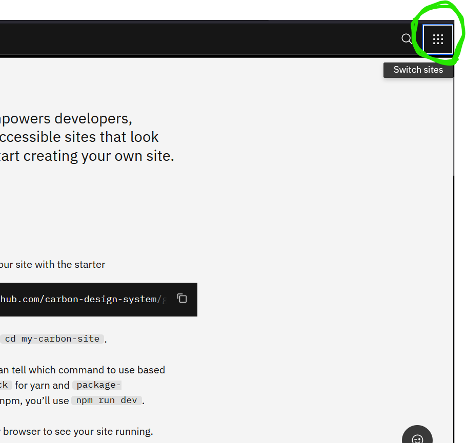
I am using a gatsby starter gatsby-theme-carbon. It has a switcher component whose code is available here. It looks like this Switcher screenshot.
How do I disable the Switcher completely using component shadowing ? ( i.e. I don't want the Switcher at all in my website).
Thanks in advance for the help.
...ANSWER
Answered 2021-Jun-05 at 09:50As you can see in Shadowing in Gatsby themes docs:
This feature allows users to replace a file in the
srcdirectory that is included in the webpack bundle with their own implementation. This works for React components, pages insrc/pages, JSON files, TypeScript files, as well as any other imported file (such as.css) in your site.
The shadowing API uses a deterministic file structure approach to know which component should or shouldn't be rendered. In your case, you just can override the CSS props to display it as none, or you just shadow and return an empty component, since shadowing is used to extend Gatsby themes. Create a src/gatsby-theme-blog/components/Switcher/Switcher.js in your project and do something like:
QUESTION
One of the values rendered in my is a boolean. I'm following the "Advanced: Joined with Page Header" from the components page, and I don't know how to render it correctly and without raising errors in my browser console. Here is my current code:
...ANSWER
Answered 2021-May-21 at 14:04you can use a hook for initialize your stringVal before the request..
QUESTION
So i'm building a design system for this company and the component system is displayed correctly in the design system storybook. But when I import it in the consumer app I get the following error
...ANSWER
Answered 2021-May-04 at 13:57I've had a similar issue when developing a component library using storybook and emotion/styled-components. The issue was that I was using the styled-components' ThemeProvider from the consumer app, as you did in your _app.js. The solution was to create and export a custom ThemeProvider on the component library, using the library's styled-component package, like so:
QUESTION
I'm working on a WPF application and I would like to style it according to Fluent Design. It seems that most aspects (responsive layout, navigation etc.) can be achieved using standard WPF mechanisms, however such features as acrylic effect and reveal highlight are quite difficult to implement in WPF.
I found certain solutions with SetWindowCompositionAttribute (Adding the "Aero Glass" blur to your Windows 10 apps), but this attribute is not documented and I'm not sure if this is the best solution. Additionally, if I understand things right, it doesn't allow me to control the acrylic color.
Is there a good way to implement fluent design in WPF?
...ANSWER
Answered 2021-Apr-16 at 07:03Unfortunately, standard WPF controls don't provide an "official" way to implement the acrylic and reveal highlight effects.
You can try using third-party libraries for this. For example DevExpress controls, which include both acrylic and reveal highlight features: Fluent Design Support.
The screenshot below illustrates what you can get:
You can download this example at How to Create a Unique Design for a WPF View using Appearance Options.
Another possible solution is to use the FluentWPF package.
Community Discussions, Code Snippets contain sources that include Stack Exchange Network
Vulnerabilities
No vulnerabilities reported
Install design-system
Support
Reuse Trending Solutions
Find, review, and download reusable Libraries, Code Snippets, Cloud APIs from over 650 million Knowledge Items
Find more librariesStay Updated
Subscribe to our newsletter for trending solutions and developer bootcamps
Share this Page