SFSymbol | SFSymbols 4 through 1.1 at your fingertips | iOS library
kandi X-RAY | SFSymbol Summary
kandi X-RAY | SFSymbol Summary
SFSymbols (1.1 and 2) is a real treat from apple, Apple's official list of Symbols that are available to use free of charge when writing software on any of Apple's recent platforms. There is one downfall however, it is a pain in the neck to look up exact symbol names, take for example:. That is a long string to remember and digging through the catalog of SF Symbols to find in would be quite a waste of time. Wouldn't it be easier if you could just use code completion?. Thats what this super micro library aims to do.
 Support
 Quality
 Security
 License
 Reuse
Reuse
Top functions reviewed by kandi - BETA
Currently covering the most popular Java, JavaScript and Python libraries. See a Sample of SFSymbol
SFSymbol Key Features
SFSymbol Examples and Code Snippets
Community Discussions
Trending Discussions on SFSymbol
QUESTION
I have set a condition to load an SFsymbol.
...ANSWER
Answered 2022-Jan-25 at 14:35It might depend on what is needed in common layout, but possible variants are
a) remove image conditionally
QUESTION
I need to have a circular UIButton that draws a custom color in the middle, along with an outer ring that is drawn as the default tint color (similar to a UIColorWell).
I've tried a few different approaches:
- Using a multicolor SFSymbol: This would be an elegant solution, but as far as I can tell there's no way to apply the tint color to just a part of the image while setting the center to be a custom color. Either the entire image is tinted, or the image is drawn as the default colors set in the symbol file. Also, I need to support iOS 14, while the new hierarchical options that may allow me to accomplish this were added to iOS 15.
- Setting various layer properties (ie, cornerRadius, borderColor, etc): This works and may be a decent fallback solution, but I'm unable to get the look that I'm going for (namely, having a transparent ring between the outer border and inner colored circle).
If there's a way to use either of the above options, please educate me! Either one seems like a better solution than:
- Overloading the draw function: This is the option I'm going with at the moment, as it allows me to have complete creative control over the look of the button. The rest of this post will be regarding this method.
So far I was able to get the button to be drawn exactly as I wanted. However, I am unable to figure out how to draw the button appropriately with regards to various state changes.
For example, if a popover is displayed, all of the normal buttons are automatically redrawn as disabled. My custom button, however, isn't redrawn so I am unable to respond to the state change.
Same thing with tapping on the button - normal buttons are briefly shown in an emphasized color but my custom button doesn't respond.
Does someone have an example as to how to support overriding UIButton drawing with various states?
...ANSWER
Answered 2021-Sep-27 at 23:18I was able to get the desired behavior by overriding tintColorDidChange in order to trigger a redraw of the button. Now I am able to draw the outer ring in the correct color (including grayed out when a popover is displayed) while maintaining the desired inner color.
QUESTION
I want to align the heights of two HStack members. The expected outcome would be that the image has the same size as the text. The current outcome is that the image has more height than the text. This is my current setup:
ANSWER
Answered 2021-Sep-24 at 16:11You can get the size of the Image small by adding a .frame() modifier to your HStack. See the code below,
QUESTION
This seems like really easy to fix, But I can't get my head around it.
How can i show SFSymbols' shift.fill if the list of upvoters contain Foo and if not, show shift
ANSWER
Answered 2021-Sep-03 at 09:51Your syntax is wrong. When using the ? operator to pass different values to an input parameter based on a Bool, you always need to put the ternary expression after the input argument label and only write out the label once.
QUESTION
I was looking here at this to try to solve my problem, and many said that this was fixed in the latest XCode version, but it is not working for me and I am on the latest public XCode version that supports iOS 14.5. I have a few arrays that each contain info such as a name, number, and description. I want each of these to appear as buttons and then when tapped on to show a sheet with a unique view to that button.
Here is a shortened example of one of my arrays:
...ANSWER
Answered 2021-May-30 at 00:49You can do something like this:
QUESTION
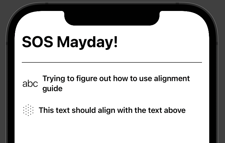
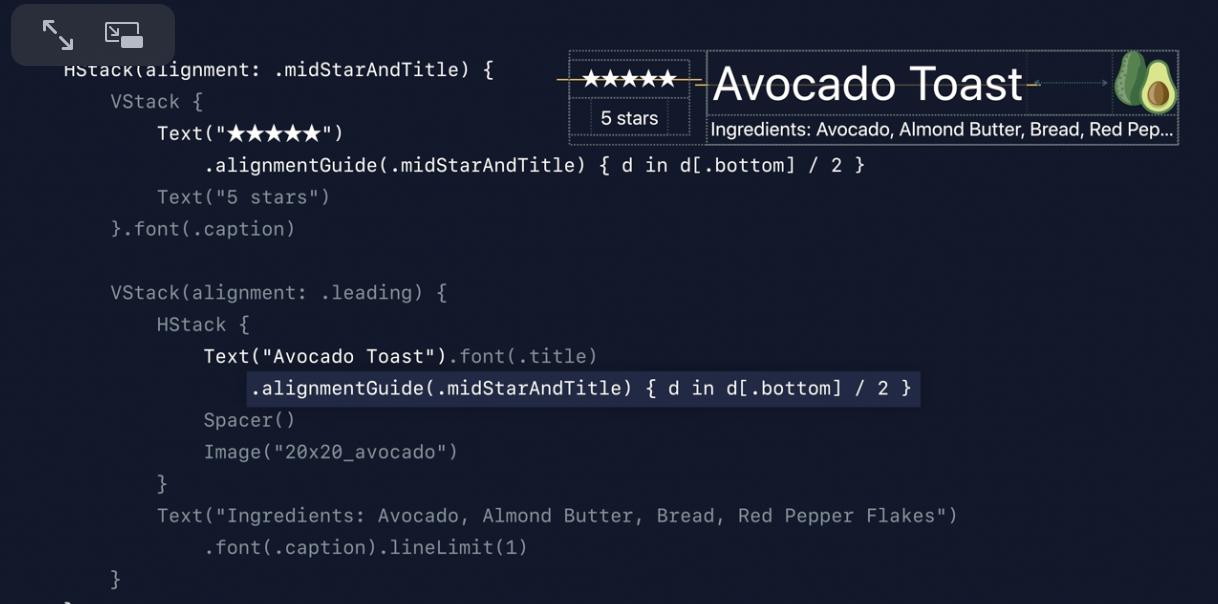
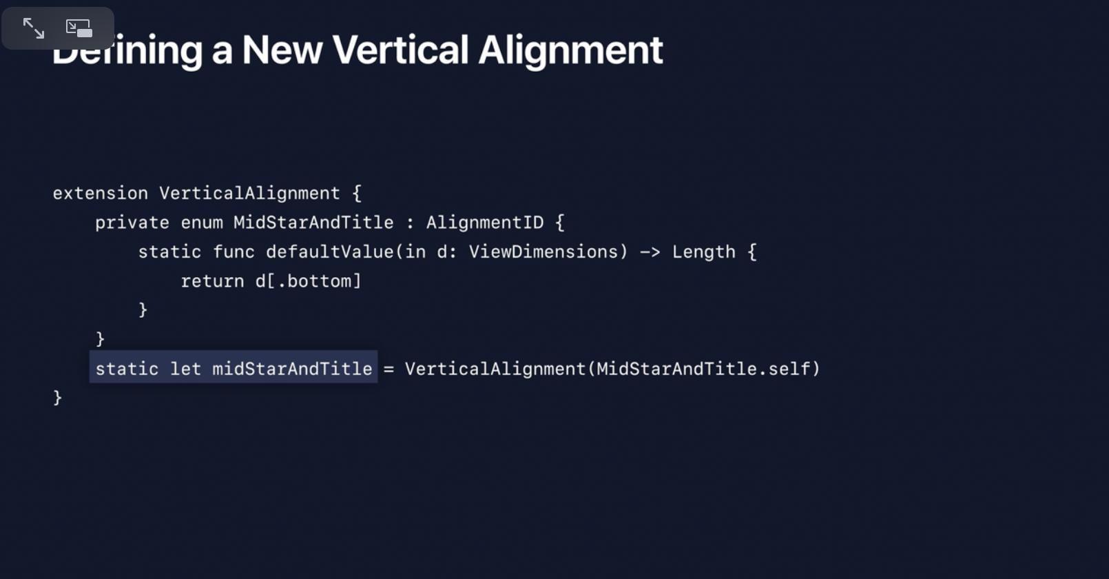
So my problem is that I am trying to align text from different HStacks. Different sized SFSymbols are causing this problem.
I know that AlignmentGuide can solve my problem but I'm not sure how to implement. If anyone can lend any insight I would be greatly appreciative!
I have watched the WWDC talk on this.
And this is the main screen that relates to this problem,
Yet I need a little clarification of to put it together.
Here is relevant code
...ANSWER
Answered 2021-Apr-09 at 05:36I was able to produce the output you want using these steps:
- Create a custom alignment enum based on AlignmentID and a static instance of it as shown in the slide you linked.
- Add a new VStack around just the part you want to custom align. Otherwise it can affect the alignment of the other components.
- Add an alignmentGuide() on the two Text's that you want to align at their leading edge.
Here is the updated code:
QUESTION
I have the following 3 components within a Horizontal stack view.
- Yellow
UILabel - Red
UIImageView - Green
UIImageView
The distribution for the Horizontal stack view is Fill.
The content mode for UIImageView is Aspect fit. They are using SFSymbol named "pin.fill".
The number of line for UILabel is 0, so that it supports multilines.
All the 3 components are having same Content Hugging Priority (250) and Content Compression Resistance Priority (750)
When Horizontal Content Compression Resistance for UILabel is 750 to 998My questions are
- Why the red
UIImagetake up most space, even though all 3 of them are having same Content Hugging Priority (250) and Content Compression Resistance Priority (750)? - My intention is letting yellow
UILabelfill up most space. However, I can only achieve so, if I increase the Horizontal Content Compression Resistance (ForUILabelonly) up to 999 or 1000. I thought, as long as any value is higher than 750 will be good enough? Does 999 or 1000 value in Horizontal Content Compression Resistance carry any special meaning?
Please do take note that, even when Horizontal Content Compression Resistance for UILabel is 999 or 1000, both red & green UIImageView's width will be compressed. But, they are compressed with different strength, which end up 2 UIImageView are having slightly different width. Why?
p/s
The complete project code is located at https://github.com/yccheok/stackoverflow/tree/master/66444344/test
...ANSWER
Answered 2021-Mar-03 at 13:01You're over-thinking things a bit.
What you want to do is tell the two image views to "hug" their content, and leave everything else at the default Hugging and Compression Resistance values.
So, Label properties:
Both "pin" image views:
It will look like this in your Storyboard:
Give this code a try... connect the label to the @IBOutlet and run the app. Each tap will cycle through 4 different length strings for the label:
QUESTION
I'm working on some code to teach myself SwiftUI, and my current project is a dice roller app.
In my view, I present some images using SFSymbols to represent the value of each die after the roll. I use two animations (.rotation3Deffect and .rotationEffect) on each image to give a visual roll of the dice.
I have found that the animations will only run if the individual die value (or in case of the code, if the Image(systemName: "\(diceValue).square.fill")) changes from one roll to the next. In other words, if I roll three dice, and they land on 1-4-6, then I roll again and they land on 1-4-7, the 1 and 4 images will perform the animation, but the image changing from 6 to 7 does not animate - it just updates to the new image. Any idea why the animation only runs on the images that did not change from the previous dice roll?
ANSWER
Answered 2020-Dec-23 at 05:37In your scenario the data identifiers in ForEach should remain the same, otherwise corresponding views are replaced and animation does not work.
The fix for this is simple - use diceNumber as ID:
QUESTION
I have 2 HStack's using geometry reader to split them evenly into 2 sections that are embedded into a VStack, I am trying to create a layout similar to the first below image (landscape mode on iPad).
However, I am struggling to get the HStack's to line up like a grid meeting in the middle. I also have a NavigationView sidebar and which can be presented alongside the HStacks so ideally the 2 images would change widths but keep their height without squashing or stretching the images. I have tried to do this using clipped().
The second image below is what I am getting when I run my code. I have replaced the images in this example to SFSymbol to make it easier to debug.
This is the NavigationView sidebar that is being called in my ContentView:
ANSWER
Answered 2020-Dec-08 at 19:22Here is a demo of possible approach - use Color.clear, as it fills everything available equally, with content in overlays.
Prepared with Xcode 12.1 / iOS 14.1
QUESTION
I am trying to add an icon ( SFSymbol) called "exclamationmark.triangle" if the field is empty to identify that it's a required text field. Below is the method I used. It works, but not properly. When the user clicks on a text field and starts typing after the first character keyboard goes away, so the user has to retap to continue typing.
...ANSWER
Answered 2020-Dec-09 at 00:57struct ContentView : View {
@State var name: String = ""
var body: some View {
HStack {
TextField("First & Last Name", text: $name)
name.isEmpty ? Image(systemName: "exclamationmark.triangle") : nil
}
}
}
Community Discussions, Code Snippets contain sources that include Stack Exchange Network
Vulnerabilities
No vulnerabilities reported
Install SFSymbol
Support
Reuse Trending Solutions
Find, review, and download reusable Libraries, Code Snippets, Cloud APIs from over 650 million Knowledge Items
Find more librariesStay Updated
Subscribe to our newsletter for trending solutions and developer bootcamps
Share this Page