styled-components | Visual primitives for the component age | Frontend Utils library
kandi X-RAY | styled-components Summary
kandi X-RAY | styled-components Summary
Visual primitives for the component age. Use the best bits of ES6 and CSS to style your apps without stress .
 Support
 Quality
 Security
 License
 Reuse
Reuse
Top functions reviewed by kandi - BETA
- Returns the current time .
styled-components Key Features
styled-components Examples and Code Snippets
 Lines of Code : 15License : Strong Copyleft (CC BY-SA 4.0)
 Copy
Copyimport { ThemeProvider } from 'styled-components'
import { COLORS } from './wherever'
const theme = {
colors: COLORS
}
function App() {
return
}
const Button = styled.button`
/* Color the border and text wiimport React from 'react'
import styled from 'styled-components'
const Search = styled.div`
background: ${props => (props.searchActive ? 'red' : `yellow`)};
`
const Parent = () => {
return (
)
}
exporimport { css } from 'styled-components'
const sizes = {
mobile: 'only screen and (max-width: 667px)',
tablet: 'only screen and (min-width: 668px)',
} as const
const mediaQueries = (Object.keys(sizes) as Array).reduce((accumulatimport styled from 'styled-components'
export const DroppableContainer = styled.div`
display: flex;
overflow: auto;
background-color: rgb(156, 186, 172);
width: 500px;
border: 5px solid;
border-color: green;
import { createGlobalStyle } from 'styled-components'

const GlobalStyle = createGlobalStyle`
  body {
    color: ${props => (props.whiteColor ? 'white' : 'black')};
  }
`

function MyApp({ Component, pageProps }) {
  return <>
}
import styled from 'styled-components'

const Button = styled.button`
  background: #0070f3;
  border-radius: 5px;
  position: relative;
  display: inline-block;
  line-height: normal;
  font-family: inherit;
  font-size: inherit;
color:interface LinkProps {
to: string;
target?: string;
as?: keyof JSX.IntrinsicElements;
className?: string;
children: ReactChildren | React.ReactNode | string;
}
import * as React from 'react'
import styled import styled from 'styled-components'
export const StyledButton=styled.button`
//your styles
`
import {StyledButton} from './StyledButton.jsx'

function App({onClick,className}: Props) {
    return (
import React from 'react'
import Image from 'next/image'
import styled from 'styled-components'

const Container = styled.div`
  position: relative;
`
 const ImageContainer = styled.div`
  position: absolute;
  left: 50%;
`


const Page: Rimport React, { useContext, Fragment } from 'react'
import AlertContext from '../../context/alert/alertContext'
import { CSSTransition, TransitionGroup } from 'react-transition-group'
import styled from 'styled-components' // TODO RefactorCommunity Discussions
Trending Discussions on styled-components
QUESTION
I want to use SVG as a React Component in my app. I'm using: react 17.0.2, Webpack 5.57.1, @svgr/webpack 6.2.1.
I followed the steps on adding svgr in webpack.config file as in svgr documents svgr-doc but there is an Error in the console dev tools:
...ANSWER
Answered 2022-Apr-10 at 20:36From your webpack rules configuration, it looks like you’re having a name clash with the last rule with type: "asset/inline", which is handling svg as well according to your test case.
To fix this, you can either remove svg in the last rule so that it becomes
QUESTION
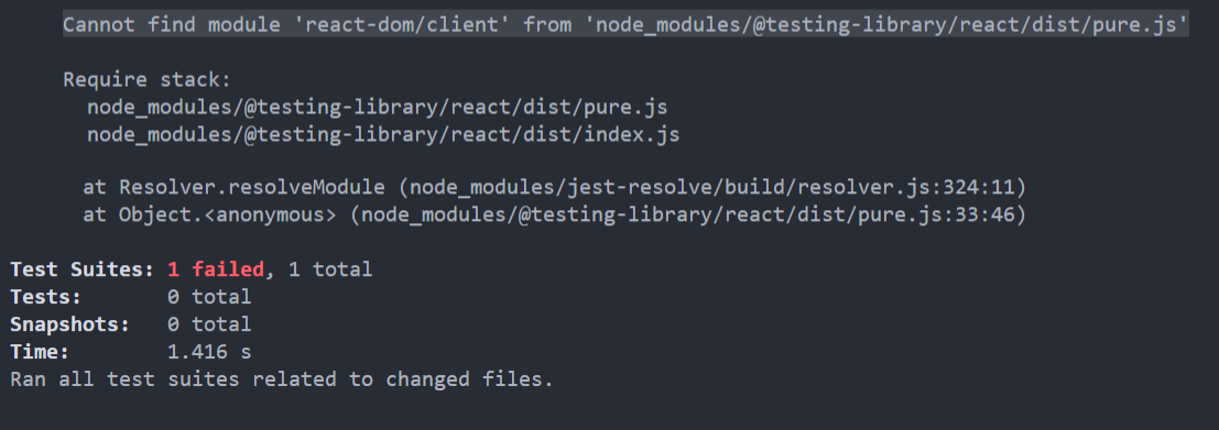
ANSWER
Answered 2022-Apr-02 at 09:43I think it's because your @testing-library/react using the newer version, just test with version of 12.1.2
QUESTION
I have been using github actions for quite sometime but today my deployments started failing. Below is the error from github action logs
...ANSWER
Answered 2022-Mar-16 at 07:01First, this error message is indeed expected on Jan. 11th, 2022.
See "Improving Git protocol security on GitHub".
January 11, 2022 Final brownout.
This is the full brownout period where we’ll temporarily stop accepting the deprecated key and signature types, ciphers, and MACs, and the unencrypted Git protocol.
This will help clients discover any lingering use of older keys or old URLs.
Second, check your package.json dependencies for any git:// URL, as in this example, fixed in this PR.
As noted by Jörg W Mittag:
For GitHub Actions:There was a 4-month warning.
The entire Internet has been moving away from unauthenticated, unencrypted protocols for a decade, it's not like this is a huge surprise.Personally, I consider it less an "issue" and more "detecting unmaintained dependencies".
Plus, this is still only the brownout period, so the protocol will only be disabled for a short period of time, allowing developers to discover the problem.
The permanent shutdown is not until March 15th.
As in actions/checkout issue 14, you can add as a first step:
QUESTION
I'm creating a project to learn React Native. I'm using typescript on this project. I added react-navigation : To make react-navigation working, I had to do :
...ANSWER
Answered 2022-Feb-05 at 12:14The new version, of react-native-gesture-handler send warning if you use an old API version, but also if one of your package/library use it.
To disable the warning, you can ignore logs.
in your app.js / app.tsx
QUESTION
I am currently setting up a boilerplate with React, Typescript, styled components, webpack etc. and I am getting an error when trying to run eslint:
Error: Must use import to load ES Module
Here is a more verbose version of the error:
...ANSWER
Answered 2022-Mar-15 at 16:08I think the problem is that you are trying to use the deprecated babel-eslint parser, last updated a year ago, which looks like it doesn't support ES6 modules. Updating to the latest parser seems to work, at least for simple linting.
So, do this:
- In package.json, update the line
"babel-eslint": "^10.0.2",to"@babel/eslint-parser": "^7.5.4",. This works with the code above but it may be better to use the latest version, which at the time of writing is 7.16.3. - Run
npm ifrom a terminal/command prompt in the folder - In .eslintrc, update the parser line
"parser": "babel-eslint",to"parser": "@babel/eslint-parser", - In .eslintrc, add
"requireConfigFile": false,to the parserOptions section (underneath"ecmaVersion": 8,) (I needed this or babel was looking for config files I don't have) - Run the command to lint a file
Then, for me with just your two configuration files, the error goes away and I get appropriate linting errors.
QUESTION
When i install a new create-react-app and add babel-plugin-styled-components and add displayName option to babel-plugin-macros.config.js it isn't adding readable classNames as in the documentation -> https://styled-components.com/docs/tooling#babel-macro.
Here is a repo with the configurations https://github.com/Futekov3216/CRA.git
P.S i dont want to eject
...ANSWER
Answered 2021-Dec-16 at 06:49Today I myself faced such a problem. The problem lies in styled-components itself. Macro in styled does not work since version 5.2.2, and it is not known when it will be fixed. Simplest solution:
QUESTION
I just started using Material UI 5.0.4 (with styled-components), and I wanted to access the theme in a component. I looked online and saw useTheme, so I checked the docs and found it - @mui/styles/useTheme. However, it was the legacy documentation, and @mui/styles does not exist in MUI 5. So, I looked at @mui/system instead, and found the section "Accessing the theme in a component". However, this just points back to the legacy documentation!
After the docs didn't seem to help me, I decided to use Visual Studio Code's "Quick Fix" feature, where if you hover over the function, VSCode will give you a list of options to import. Here is the list of options I tried, and why they didn't work:
@mui/material/styles/useTheme- Returns the default theme object, no matter what. Looking into the source code, this is literally what it does - it switches to the default theme, and then returns the theme.@mui/material/private-theming/useTheme- This just returnsnull. I feel like I shouldn't be accessing this anyway (it saysprivate-), but I tried it anyway.@mui/system/useTheme- This is what I was hoping would work. However, this is also probably the weirdest one. It gives me the default theme, but it excludes many properties. For example, it only providedpalette.mode, and there are no other keys underpalettethan that. (You can see the whole thing below)
ANSWER
Answered 2021-Dec-11 at 19:07It turns out that the correct useTheme is @mui/material/styles/useTheme, and you cannot use useTheme in the same component that you do the ThemeProvider in. For example, this:
QUESTION
After upgrading my webpack from v4 to v5, I got this error that is getting me a hard time debugging.
...ANSWER
Answered 2021-Nov-30 at 00:05For my version of this error, the issue seemed to be that I was importing a file with an alias in webpack from within the same directory.
To give an example, I had this directory setup:
QUESTION
- How can you tell SWC to compile CSS files imported in React components?
- How can you tell SWC to compile absolute imports in tests and in React components?
Here is a minimal reproducible example.
ContextWe're migrating from Babel to SWC. (I asked a question a little while ago. I'm improving on that question's answer.)
We're migrated the command from:
...ANSWER
Answered 2022-Jan-31 at 22:53- How can we help SWC understand CSS (or mock CSS modules)? - SWC doesn't understand css natively, and neither did Babel. As you noted, when you were using Babel, the plugin
styled-componentstook care of this. You'll need to do the same with SWC. I can't find an existing SWC plugin that does this, but you can roll your own. Obviously this is a pain, but such is the cost of using new tooling. - How can we help SWC understand absolute imports? - The
.swrcoptions forbaseUrlandpathsshould do what you want, but that, too, seems to have some issues.
You may have better luck creating issues directly in the @swc-node GitHub repo, but given the comments there it feels like you might be SOL for a while. Might be faster/easier to rewrite your tests using one of the libraries that Next supports out of the box.
QUESTION
Please i'm getting this error from @mui/material library, I have checked the package.json of the mui/system and it has alpha exported in it.
...ANSWER
Answered 2022-Jan-12 at 09:07I think the problem is that you have mixed Material UI version 4 and 5 libraries and they are incompatible with each other. Try replacing @material-ui/core with @mui/core and just remove @material-ui/icons import as you already have @mui/icons-material and use the latest versions of all @mui/* imports.
Clear node_modules before installing dependencies again, to make sure everything is in order and old dependency versions are removed.
EDIT: what turned out to be necessary to solve it in the end - install node v12.22.7, remove node_modules, clean yarn cache and reinstall dependencies
Community Discussions, Code Snippets contain sources that include Stack Exchange Network
Vulnerabilities
No vulnerabilities reported
Install styled-components
Support
Reuse Trending Solutions
Find, review, and download reusable Libraries, Code Snippets, Cloud APIs from over 650 million Knowledge Items
Find more librariesStay Updated
Subscribe to our newsletter for trending solutions and developer bootcamps
Share this Page