Flex2 | sega megadrive sprite editor | Game Engine library
kandi X-RAY | Flex2 Summary
kandi X-RAY | Flex2 Summary
Flex 2 is a sprite editor for the Sega Megadrive.
 Support
 Quality
 Security
 License
 Reuse
Reuse
Top functions reviewed by kandi - BETA
- Initialize the Electron environment .
- Get sprite size .
- Transform an array of meta data to a meta object .
- Export a sprite string
- Import sprite file
- Make an offset table .
- Convert a meta object into a value .
- Parses an ASM
- Import a new sprite .
- Attach moused move move .
Flex2 Key Features
Flex2 Examples and Code Snippets
Community Discussions
Trending Discussions on Flex2
QUESTION
I am trying to achieve following responsive layout using flexbox as show in below image..
i tried few thing but is not getting the desired result.
Each item in this design has a image and top of that i need to show blog Title, date & category but i am not able to get the layout right
Currently i am doing same without flexbox but its lot of css and other tags, i though i could change same with less code using flex.
I have looked at lot of example but i am not able to find 1 example similar to my layout
current page is using bootstrap v3.3.6 which i cant change as it can impact other parts of the website
...ANSWER
Answered 2022-Feb-19 at 13:07I would suggest you use grid, there are many ways to achieve this but most definitely flex is not the best way to deal with a grid like this if you care about media query. Nevertheless, one way is to use positions and flex. But its a trade off.
QUESTION
ANSWER
Answered 2022-Feb-03 at 13:57It can be simplified using nullable selectedIndex, int? selectedIndex;.
Containers color and width logic will be
QUESTION
I'm creating a react native app i have a item - a plus button(shown in image)
I want this to the bottom of my page onto footer -
but the problem is that when i place this button on bottom with position: 'absolute', bottom: 0 it's only going to the bottom of the hero section & not to the footer
Code -
...ANSWER
Answered 2022-Jan-21 at 13:33The problem si that you are applying the absolute css position to the View inside the TouchableOpacity and not to the TouchableOpacity itself.
To achieve what you want to do, you should write something like:
QUESTION
I'm playing around with the GreenSock F.L.I.P plugin and Vue.Js and i stumble on an issue
What I'm tryingI tried changing the layout with a data property in VueJs instead of a class toggle
Example/ CodeBut I don't know if it could works and why what I have done doesn't
Since you can't add paying greenSock plugins into Stack Overflow snippet I made a codepen to show you the error: https://codepen.io/FreeStab/pen/MWpxEXm
Here is the working code
...ANSWER
Answered 2021-Jun-18 at 17:01Changes in frameworks are done asynchronously so updates can get batched together. So you need to wait for the DOM to render those changes.
https://vuejsdevelopers.com/2019/01/22/vue-what-is-next-tick/
QUESTION
I made a card as part of a list of cards. I set it up as a flexbox row and worked good.
So I wanted to make the page responsive. Instead of the card being in a row, it seemed it was best to made a the image and a div of the text (grouped in a div as rows) So the image and the text is one flex and the 2nd row is itself a flex in a column. And that worked nice.
However, that extra div is breaking up my original flexbox layout. Which I suspected might be the case. This is the normal web browser view now.
Here's the code for the html (its a ruby ERB).
...ANSWER
Answered 2021-May-05 at 16:11Use a media query to display your information in column just under a certain breakpoint:
QUESTION
Need some help for that. I want to create a dynamic portfolio class with css and js. I can't seem to get my wrapper element to take an extra class depending on the number of HTLM children in the div. if there are 5 children the element will have to take the class "wrapper5" if there are 4 children it will take the class "wrapper4" etc ... These css classes just need to add a grid-template-areas.
Hope you have info to help me find a solution. (and sorry for my english)
...ANSWER
Answered 2021-Mar-15 at 09:30First, you can't have multiple id's. Just use id wrapper1, wrapper2 and so on.
QUESTION
ANSWER
Answered 2020-Dec-08 at 18:21Use str.slit with expand:
QUESTION
I've two question's about flexboxes but can't find the answer to this.
I want to create 4 boxes that have all the same width and the same height without using the viewport. for example: I create one box with a 50% width and the height needs to be equal to the width. All the other boxes get the same properties.
If I have those boxes I would like to set div's inside one of those square's, one that takes a height of 20% and the whole width of that box. how can I set the height to 20% and make sure the box doesn't extend?
my code so far:
...ANSWER
Answered 2020-May-02 at 15:35The answer is NO. The reason is provided in the flexbox specification: https://www.w3.org/TR/css-flexbox-1/#flex-lines
You can accomplish that now with display: grid:
https://codepen.io/pgurav/pen/eYpeOEp
Although the grid itself is not flexbox, it behaves very similar to a flexbox container, and the items inside the grid can be flex.
The grid layout is also very handy in the case you want responsive grids. That is, if you want the grid to have a different number of columns per row you can then just change grid-template-columns:
QUESTION
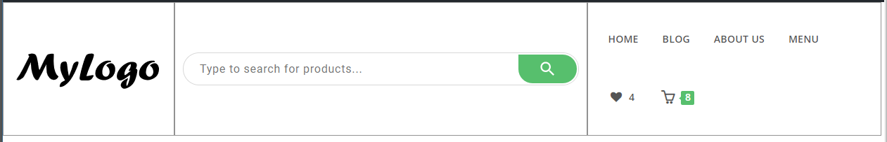
is anyone here using Elementor?
I'm trying to create a header with Elementor. 3 columns, I have a logo in the left, search bar in the middle and a navigation menu on the right side.
Basically, what I wanted to achieve is something like this. Expected Output
But what I'm currently done is Output
Adding a border on it Output-with-Border
Here is the issue when the screen/window is resized Issue
Where it should be something like this Expected-output-on-resize
To give you more details, I wanted to achieve the same functionality as the below code on Elementor.
...ANSWER
Answered 2020-Apr-08 at 15:00I don't think it's possible by using the free version of Elementor. However you can still achieve what you want.
The idea is by using the ShortCode.
Since you are using OceanWP theme plugin then you will need to install the Ocean Extra plugin first.
STEP 1: Create templates
You will need to create a template for those four elements by navigating into your WordPress Dashboard > My Library then create the templates by clicking the Add New button and name them with the following:
- search-bar
- logo
- navigation-menu
- header
Each of the templates you created will generate a shortcode so take note of them.
STEP 2: Edit the templates you created using Elementor
Edit the template you created using Elementor, on the search-bar use the widget of Advanced Woo Search since you said you are using its plugin, you may also use its shortcode if it has a shortcode,just search for the widget ShortCode in Elementor then drag and drop it into the section, input the shortcode of the Advanced woo search then make the width full and 100%, save and publish it.
In the template Logo, edit it again using Elementor then use the widget Custom Header Logo as you said you are using it, then go to Advanced > Positioning then set the Width to Inline(Auto) and Vertical Align to Start. This will position the logo in the Left side of the section otherwise, position it into the left side, save and publish it.
Edit the template navigation-menu using Elementor, from the widgets search for Custom Header Nav and use it then position it into the right side of the section.
NOTE: You don't have to change anything in the section of Elementor.
The last thing is the header template, before editing the header template, you must create a shortcode with the tag you created, so don't edit it yet, proceed to next step.
STEP 3: Create a shortcode under your function.php
QUESTION
I'm rendering datas with an ngFor loop, the problem is that it cause the body to add an overflow with the size of the datas, example : I want to render datas inside 50% of the page and to see the others you'll need to scroll with an overflow inside the data div.
P.S : I've already tried with vh in CSS and overflow-y: hidden doesn't solve my problem
If anyone have a fix for it I'll be really glad to ear it, thank's in advance! Don't hesitate to tell me if things are unclear
Picture of the page :
HTML sample
...ANSWER
Answered 2020-Jan-30 at 15:01It seems the overfow you want to take off is the one of html or the body.
Try this:
Community Discussions, Code Snippets contain sources that include Stack Exchange Network
Vulnerabilities
No vulnerabilities reported
Install Flex2
Support
Reuse Trending Solutions
Find, review, and download reusable Libraries, Code Snippets, Cloud APIs from over 650 million Knowledge Items
Find more librariesStay Updated
Subscribe to our newsletter for trending solutions and developer bootcamps
Share this Page